
Evaluation
Our short film:
Our short film poster:

Our short film review:

1. In what ways do your media products use, develop or challenge forms and conventions of real media products?
a) The Main Task - Short Film
This question can be seen to have difficulties in the sense that short films contain some of the most creative and unconventional work found in film making. As our main task consisted of researching the conventions and forms of short films as well as creating our own, this inflicted some creativity in decisions and ideas. Although, there are common features used within real short films and our short film that can be discussed.
Real Media Products
In terms of camerawork, real short films tend to use forms of close up shots, e.g. medium close up, close up and extreme close up (used in 'Cluck'). However, extreme long shots are also used but less commonly, as shown in 'Alone' where the male protagonist is
 shown through a high angle. Moving onto angles, the conventional angle used in the short films I researched was a mid angle, which is used mainly to show a conversation - between characters together or characters and the audience - with perhaps equal power in terms of representation. It is also conventional for real short films to use still shots and from the ones I have researched, movement is minimalistic or even unrecognisable, however, pans and tracking shots are used sometimes as in 'INSiDE'. Focus pulls are another method used within the short films I have researched which create realisation and drama and are conventional particularly in the thriller genre. Moreover, eye-line matches and graphic matches play a major part in film making, particularly in short films. Within the short films I have researched, graphic matches and eye-line matches were used in over half.

Moving on to sound, there is a tendency for short films to use a blend of diegetic and non-diegetic sound, especially in the films I have researched. The diegetic sound used within the short films I have researched consists mainly of on screen dialogue, though 'INSiDE' diverts from this convention in use of diegetic off-screen sound as the dialogue is implied to be present by the action of the film. Non-diegetic sound used is conventionally music/soundtrack which is contrapuntal to the films genre, as with 'Table 7'. Conversely, the diegetic sound used is parallel with use of foleys being particularly prominent, such as the knocking sound in 'Alone'. What becomes evident when looking back over my real short film research and analysis is that crescendos are used massively, being used within almost every film. The crescendo used in 'Cluck' is used right at the start and draws the spectator in. Looking back, perhaps a crescendo within our short film would have developed the conventions of the short films we researched. However, I do feel that a crescendo within our film would have been irrelevant perhaps distracting from the main plot.

Mise en scene distinguishes many conventions and forms of real media products by generating iconography. The mise en scene used within the films I have researched are very generic of the setting, for example in 'Table 7' where the decor and props are all very commonly found in a restaurant setting. Alongside this, the costumes, hair and make-up of the characters are also generic of the setting and genre. Looking at the genres of the films I have researched, the mise en scene is very iconographic, particularly in 'INSiDE'. Furthermore, I have noticed that the mise en scene used within the real media films is minimalistic and not at all chintzy, everything in the shots are there for a reason. This differs in 'Alone' which does have a wider range of props and decor than the others. This could be that the film was a lower budget and therefore used a 'lived-in' house as the setting. But, this could have been used to create realism. Manipulation of space and time is used very well within the short films, manipulating space to a greater extent than time. Match on action is used in partnership with manipulation of space within
 every short film and is completed to a detailed and precise extent. Additionally, the 180 degree rule is used within the short films which involve more than one character being used successfully in 'Table 7'. This creates a sense of continuity and flow within the real short film, this is something we really tried to convey over into our short film. Low-key lighting is used within some of the short films of the thriller and sci-fi genres ('Table 7') but high-key lighting is used in others, e.g. 'Cluck' and 'Alone'. Facial expression and body language also play a major part in the mise en scene of a short film, coupled with characterisation.
Editing and post production can play a huge part in determining how a short film comes together after filming. It would appear from my research that the most conventional form of a transition is a cut being used in every film multiple times. Some of the cuts used within the short films are used to manipulate time by creating a fast pace and a tense impression. Dissolve transitions are used in the short film 'Cluck' which is of the comedy genre. Editing is used also in some shots to add effects to the shots themselves, as used in 'Cluck' where the colouring is de-staurated.

Genre conventions can be portrayed through editing and post production. In terms of Rick Altman's theory. The semantic codes common within the real short films are that the costume; hair; make-up; props; decor and setting are all iconographic to their genre. This iconographic mise en scene paired with iconographic editing can create a convention in itself and will converge to the genre of the short film e.g. sci-fi film 'INSiDE' the fast cut pace paired with the iconographic costume, hair and make-up conform to the sci-fi genre. Looking at syntactic codes in terms of Rick Altman's theory, in 'Alone' dialogue creates the sense that the spectator is in the protagonists mind. We hoped to create this impression in a section of our short film when the characters are walking in the woods and I think we did this very well. Other conventional syntactic codes used are binary oppositions in relation to Levi Strauss, stereotypes and relationships. The table below shows the semantic and syntactic codes.

Looking at Steve Neale and David Buckingham's theories' the films all seem to repeat genre conventions in some way (such as in 'The Elevator') or are hybrids such as 'Table 7'.
Steve Neale

Steve Neale's theory states that a short film or feature film will either repeat or vary from the conventions used within genre. Looking at the short films we have researched it would appear that both are used to some extent. Short film directors like to experiment to see what works and is the most diverse. For this reason, variation is used in some aspects of genre to appear more individual and unique and less mainstream. An example of this is in 'Cluck' where the use of de-saturated colour varies from the conventions of the lighting and colour in films and short films of the comedy genre. However, 'Cluck' also repeats conventions of the genre by using comedic props and sound effects. Within our short film we wanted to do the same, using repetition and variation in different aspects. I feel as though we did this successfully with our romance and social realism hybrid by repeating the convention of the binary opposition and the two going out together. But, varying from the genre towards the end when the male protagonist is killed.
 David Buckingham
Similarly to Steve Neale's theory, David Buckingham's theory states that a short film will either negotiate with the conventions of the genre or change them. It is relatively similar to Steve Neale's theory as short films do tend to negotiate with the genre of the short film. Short film and film directors are not likely to completely change a genre convention unless they are being very experimental. Negotiating the genre conventions allows the film or short film to still be identified as that genre, just with more original ideas, diverging from the mainstream ideology of how a certain genre should appear. In our short film we did change the main genre to some extent by making it a hybrid genre. Yet, I would say we negotiated with the genres more than changing them, as aforementioned, by using mise en scene iconographic to our genre.
Within short films narrative organisation and short film format help to create the plot of the film. It is typical for restricted narration to be used within short films and has been in some of the short films I have researched e.g. 'INSiDE'. Plus, all of the short films I researched follow a linear narrative with some cross cuts in some films, e.g. 'Lovefield' and in 'Cluck' between the chicken toy and the dog. However, in other short films we have researched, as shown in Maisie and Megan's research, the standard structures of narrative are usually adapted, with short films tending to use circular, multi-strand and non-linear narratives, for example, much more commonly than feature length films to be as original a possible. Such as 'Money Makes the World go round' a short film we found externally from our research that follows a circular narrative. Watch here - https://www.youtube.com/watch?v=k5xHDOH1A3c
Vogler
The short films we have researched tend to challenge the conventions of feature length films to be as original as possible. In terms of Vogler's theory, of the short films we have researched, the theory cannot be applied fully to any of them. With most only using one or two steps sometimes not in the order we would expect. Short films may not also have a 'hero', therefore some have been adapted to be just the protagonists journey.
Bordwell and Thompson

Story and plot are used majorly to the advantage of the director in the creation of short films. Using the main plot of the story within the short film allows everything important to be included without the film being too long. The plot used also suggests a typical story anyway, allowing the spectator to form an ideology of the back-story in their minds. We used this technique after discovering how successful it was in the short films we researched, particularly in 'INSiDE', 'Sweet Nothings' and 'Office Space'.
Levi Strauss
Binary oppositions play a major role in short films, allowing the spectator to have an in-depth experience and feel emotions. The short films we researched used the convention of male v female but also added more, rather interesting binary oppositions to be as creative and original as possible. In 'INSiDE' the binary oppositions created such as sane v insane create a very dynamic impression on the film, making it perhaps, more successful due to it's originality. The directors of short films like to experiment to make their short film 'out-there' and less mainstream. For this reason, the short films we have researched have developed binary oppositions that aren't commonly used. We also used this technique within our short film to use the conventions of how a short film is made as well as the conventions in them as well.
 Roland Barthes
The use of enigma and action codes are vital to be used correctly within short films. If these codes are not used in the right way, too much may be given away towards the beginning or the use may become confusing if a large amount are used. In short films, enigma codes are used frequently, but not so many that the plot gets confusing, as the codes tend to be answered towards the end. The most common enigma code used in short film is at the beginning of the film when a character is shown but not introduced. We used this code in our short film, showing we used this convention in relation to Barthes' theory. Looking at action codes, the action codes used in short films all differ in relation to the plot, however they are not usually massive 'give-aways'. The actin codes used are commonly not very important and provide little to the plot or the ending. We used this technique in our short film, using the blind stick as an action code which the spectator may think has a relation to the climax of the plot, yet it doesn't. This technique is also used in 'Just Say Hi' and 'Connection' as well as other short films we researched.
Todorov

The use of Todorov's theory in short film is very similar to Vogler. The theory is sometimes used but mostly challenged to ensure a short film is as original as possible. The first equilibrium tends to be used along with a disruption. Though, from there onwards, short films differ in relation to the theory. In 'Alone' there is a recognition of the disruption but no attempt to repair the damage as it is so big. In other short films we have researched such as 'Brando-ing', 'Touch' and 'Sweet Nothings' the conventions and relation in terms of the theory are again, creative. We intended to be creative in our use of this theory and I think we did, whilst still converging to the use of the theory in some ways also.

Equilibrium - Faith and Ethan at College.
Disruption - Faith gets bullied.
Recognition - Ethan goes to help her.
Repairing the damage- Ethan becomes her friend.
New equilibrium - They become friends and start to form a romance.
As shown, we use the theory towards the beginning of our short film and perhaps even more than once. This shows our use of the theory convention as well as our use of the short film conventions.
Characterisation within short film usually diverts heavily from using stereotypes. This is demonstrated within the characters of all of the short films we have researched all of whom spectators can relate to and give new outlooks on the general stereotypes, this is shown in 'Silent Things' and 'Just Say Hi'. In 'Alone' the male protagonist acts as a reference of a 'normal' male who many could relate to, whether it be themselves, brother, etc. In contrast to in 'INSiDE' where some of the characters are completely unique and show characterisation in their own way. In relation to mise en scene, facial expression and body language also add to characterisation.
Within both films and short films themes and issues can be used to create a link with the spectator. Binary oppositions are particularly prominent in the short films I have analysed with the main one being male versus female; as in 'Table 7'. We attempted to incorporate this binary opposition (in terms of Strauss) into our short film and I think we did it very successfully. Themes and issues are much more varied in contrast to feature films as the short film directors like to experiment and be original. For example all feature length films tend to follow Propp's theory - having a hero, villain, princess, etc. The narrative also tends to follow Vogler's theory of the hero's journey, this is particularly obvious in romance or sic-fi romance feature length films. In short films the themes and issues used tend to follow no structure and challenge usual conventions to make the short film as unique as possible.


Our Short Film
Looking at our short film, conventions of camerawork used are medium close ups and close ups, similar to that of the films I researched. We also made use of extreme long shots many times to establish setting. Paired with mid angles, these shots were the most conventional of our short film, as with the real media products, this shows that we have used forms of conventions of real media films within camerawork. Though, we have also developed and challenged the conventions as we used a birds eye view long shot, long shots may be conventional so we are developing this form within our film. Yet, birds eye views are rarely ever used and possibly not at all within the real media films I researched so we are challenging the conventions by using this technique. But, I do feel like it adds to the plot and creates ambiguity. Remembering that our shots were mostly two shots also, this develops the conventions of some media films as two shots were only really used within the short film 'Table 7'.
Moving on to sound, there is a tendency for short films to use a blend of diegetic and non-diegetic sound, especially in the films I have researched. The diegetic sound used within the short films I have researched consists mainly of on screen dialogue, though 'INSiDE' diverts from this convention in use of diegetic off-screen sound as the dialogue is implied to be present by the action of the film. Non-diegetic sound used is conventionally music/soundtrack which is contrapuntal to the films genre, as with 'Table 7'. Conversely, the diegetic sound used is parallel with use of foleys being particularly prominent, such as the knocking sound in 'Alone'. What becomes evident when looking back over my real short film research and analysis is that crescendos are used massively, being used within almost every film. The crescendo used in 'Cluck' is used right at the start and draws the spectator in. Looking back, perhaps a crescendo within our short film would have developed the conventions of the short films we researched. However, I do feel that a crescendo within our film would have been irrelevant perhaps distracting from the main plot.
Mise en scene distinguishes many conventions and forms of real media products by generating iconography. The mise en scene used within the films I have researched are very generic of the setting, for example in 'Table 7' where the decor and props are all very commonly found in a restaurant setting. Alongside this, the costumes, hair and make-up of the characters are also generic of the setting and genre. Looking at the genres of the films I have researched, the mise en scene is very iconographic, particularly in 'INSiDE'. Furthermore, I have noticed that the mise en scene used within the real media films is minimalistic and not at all chintzy, everything in the shots are there for a reason. This differs in 'Alone' which does have a wider range of props and decor than the others. This could be that the film was a lower budget and therefore used a 'lived-in' house as the setting. But, this could have been used to create realism. Manipulation of space and time is used very well within the short films, manipulating space to a greater extent than time. Match on action is used in partnership with manipulation of space within
Editing and post production can play a huge part in determining how a short film comes together after filming. It would appear from my research that the most conventional form of a transition is a cut being used in every film multiple times. Some of the cuts used within the short films are used to manipulate time by creating a fast pace and a tense impression. Dissolve transitions are used in the short film 'Cluck' which is of the comedy genre. Editing is used also in some shots to add effects to the shots themselves, as used in 'Cluck' where the colouring is de-staurated.
Genre conventions can be portrayed through editing and post production. In terms of Rick Altman's theory. The semantic codes common within the real short films are that the costume; hair; make-up; props; decor and setting are all iconographic to their genre. This iconographic mise en scene paired with iconographic editing can create a convention in itself and will converge to the genre of the short film e.g. sci-fi film 'INSiDE' the fast cut pace paired with the iconographic costume, hair and make-up conform to the sci-fi genre. Looking at syntactic codes in terms of Rick Altman's theory, in 'Alone' dialogue creates the sense that the spectator is in the protagonists mind. We hoped to create this impression in a section of our short film when the characters are walking in the woods and I think we did this very well. Other conventional syntactic codes used are binary oppositions in relation to Levi Strauss, stereotypes and relationships. The table below shows the semantic and syntactic codes.
Looking at Steve Neale and David Buckingham's theories' the films all seem to repeat genre conventions in some way (such as in 'The Elevator') or are hybrids such as 'Table 7'.
Steve Neale
Steve Neale's theory states that a short film or feature film will either repeat or vary from the conventions used within genre. Looking at the short films we have researched it would appear that both are used to some extent. Short film directors like to experiment to see what works and is the most diverse. For this reason, variation is used in some aspects of genre to appear more individual and unique and less mainstream. An example of this is in 'Cluck' where the use of de-saturated colour varies from the conventions of the lighting and colour in films and short films of the comedy genre. However, 'Cluck' also repeats conventions of the genre by using comedic props and sound effects. Within our short film we wanted to do the same, using repetition and variation in different aspects. I feel as though we did this successfully with our romance and social realism hybrid by repeating the convention of the binary opposition and the two going out together. But, varying from the genre towards the end when the male protagonist is killed.
David Buckingham Similarly to Steve Neale's theory, David Buckingham's theory states that a short film will either negotiate with the conventions of the genre or change them. It is relatively similar to Steve Neale's theory as short films do tend to negotiate with the genre of the short film. Short film and film directors are not likely to completely change a genre convention unless they are being very experimental. Negotiating the genre conventions allows the film or short film to still be identified as that genre, just with more original ideas, diverging from the mainstream ideology of how a certain genre should appear. In our short film we did change the main genre to some extent by making it a hybrid genre. Yet, I would say we negotiated with the genres more than changing them, as aforementioned, by using mise en scene iconographic to our genre.
Within short films narrative organisation and short film format help to create the plot of the film. It is typical for restricted narration to be used within short films and has been in some of the short films I have researched e.g. 'INSiDE'. Plus, all of the short films I researched follow a linear narrative with some cross cuts in some films, e.g. 'Lovefield' and in 'Cluck' between the chicken toy and the dog. However, in other short films we have researched, as shown in Maisie and Megan's research, the standard structures of narrative are usually adapted, with short films tending to use circular, multi-strand and non-linear narratives, for example, much more commonly than feature length films to be as original a possible. Such as 'Money Makes the World go round' a short film we found externally from our research that follows a circular narrative. Watch here - https://www.youtube.com/watch?v=k5xHDOH1A3c
Vogler
The short films we have researched tend to challenge the conventions of feature length films to be as original as possible. In terms of Vogler's theory, of the short films we have researched, the theory cannot be applied fully to any of them. With most only using one or two steps sometimes not in the order we would expect. Short films may not also have a 'hero', therefore some have been adapted to be just the protagonists journey.
Bordwell and Thompson
Story and plot are used majorly to the advantage of the director in the creation of short films. Using the main plot of the story within the short film allows everything important to be included without the film being too long. The plot used also suggests a typical story anyway, allowing the spectator to form an ideology of the back-story in their minds. We used this technique after discovering how successful it was in the short films we researched, particularly in 'INSiDE', 'Sweet Nothings' and 'Office Space'.
Levi Strauss
Binary oppositions play a major role in short films, allowing the spectator to have an in-depth experience and feel emotions. The short films we researched used the convention of male v female but also added more, rather interesting binary oppositions to be as creative and original as possible. In 'INSiDE' the binary oppositions created such as sane v insane create a very dynamic impression on the film, making it perhaps, more successful due to it's originality. The directors of short films like to experiment to make their short film 'out-there' and less mainstream. For this reason, the short films we have researched have developed binary oppositions that aren't commonly used. We also used this technique within our short film to use the conventions of how a short film is made as well as the conventions in them as well.
Roland BarthesThe use of enigma and action codes are vital to be used correctly within short films. If these codes are not used in the right way, too much may be given away towards the beginning or the use may become confusing if a large amount are used. In short films, enigma codes are used frequently, but not so many that the plot gets confusing, as the codes tend to be answered towards the end. The most common enigma code used in short film is at the beginning of the film when a character is shown but not introduced. We used this code in our short film, showing we used this convention in relation to Barthes' theory. Looking at action codes, the action codes used in short films all differ in relation to the plot, however they are not usually massive 'give-aways'. The actin codes used are commonly not very important and provide little to the plot or the ending. We used this technique in our short film, using the blind stick as an action code which the spectator may think has a relation to the climax of the plot, yet it doesn't. This technique is also used in 'Just Say Hi' and 'Connection' as well as other short films we researched.
Todorov
The use of Todorov's theory in short film is very similar to Vogler. The theory is sometimes used but mostly challenged to ensure a short film is as original as possible. The first equilibrium tends to be used along with a disruption. Though, from there onwards, short films differ in relation to the theory. In 'Alone' there is a recognition of the disruption but no attempt to repair the damage as it is so big. In other short films we have researched such as 'Brando-ing', 'Touch' and 'Sweet Nothings' the conventions and relation in terms of the theory are again, creative. We intended to be creative in our use of this theory and I think we did, whilst still converging to the use of the theory in some ways also.
Equilibrium - Faith and Ethan at College.
Disruption - Faith gets bullied.
Recognition - Ethan goes to help her.
Repairing the damage- Ethan becomes her friend.
New equilibrium - They become friends and start to form a romance.
As shown, we use the theory towards the beginning of our short film and perhaps even more than once. This shows our use of the theory convention as well as our use of the short film conventions.
Characterisation within short film usually diverts heavily from using stereotypes. This is demonstrated within the characters of all of the short films we have researched all of whom spectators can relate to and give new outlooks on the general stereotypes, this is shown in 'Silent Things' and 'Just Say Hi'. In 'Alone' the male protagonist acts as a reference of a 'normal' male who many could relate to, whether it be themselves, brother, etc. In contrast to in 'INSiDE' where some of the characters are completely unique and show characterisation in their own way. In relation to mise en scene, facial expression and body language also add to characterisation.
Within both films and short films themes and issues can be used to create a link with the spectator. Binary oppositions are particularly prominent in the short films I have analysed with the main one being male versus female; as in 'Table 7'. We attempted to incorporate this binary opposition (in terms of Strauss) into our short film and I think we did it very successfully. Themes and issues are much more varied in contrast to feature films as the short film directors like to experiment and be original. For example all feature length films tend to follow Propp's theory - having a hero, villain, princess, etc. The narrative also tends to follow Vogler's theory of the hero's journey, this is particularly obvious in romance or sic-fi romance feature length films. In short films the themes and issues used tend to follow no structure and challenge usual conventions to make the short film as unique as possible.
Our Short Film
Looking at our short film, conventions of camerawork used are medium close ups and close ups, similar to that of the films I researched. We also made use of extreme long shots many times to establish setting. Paired with mid angles, these shots were the most conventional of our short film, as with the real media products, this shows that we have used forms of conventions of real media films within camerawork. Though, we have also developed and challenged the conventions as we used a birds eye view long shot, long shots may be conventional so we are developing this form within our film. Yet, birds eye views are rarely ever used and possibly not at all within the real media films I researched so we are challenging the conventions by using this technique. But, I do feel like it adds to the plot and creates ambiguity. Remembering that our shots were mostly two shots also, this develops the conventions of some media films as two shots were only really used within the short film 'Table 7'.
 |
| Birds eye view long shot we used |
 |
| Comparison to the use of two shots in 'Table 7' to our short film |
 |
| Comparison to the use of two shots in our short film and 'Table 7' |
With sound, we knew we wanted to incorporate some sort of non-diegetic music or soundtrack but thought it would be difficult to find one suitable. However the soundtrack and singing we have used is parallel with the beginning of the short film as it shows happiness. Towards the end, though, the music and singing does become rather contrapuntal and suggests a sinisterness behind the entire plot. Watching our short film back, I do recognise that there are some mild crescendos used to add tension and a small amount of drama. This is used mainly when the ending is about to come before they have taken their photo in the photo booth. As a group we decided that silence would be one of the best options for us in terms of sound to create an enigmatic effect and leave the spectator constantly on edge. Also showing the protagonists to be in 'their own world'. I believe this technique has worked exceptionally well and though not used really at all in any of the short films I researched, does show we have challenged the forms and conventions to perhaps create our own new idea, adding to our hybrid.

Mise en scene is a part of our short film that we take pride in. We really tried to create the ideology that Faith was of a working class and suffered from severe bullying with her disability. Again with our film, the mise en scene used was very generic of the setting perhaps stereotypical. The mise en scene we use, however, is iconographic of the romance genre e.g. high key lighting. We attempted to manipulate space within our short film through use of the 180 degree rule, match on action and eye-line match especially used with Faith to show how difficult her disability can be but how she has learnt to work with it. Editing and post production played a major part in our film particularly towards the end. In terms of transitions we use cuts, wipes, dissolves and fades to add a variation and develop the conventions of other films. Cuts add a fast pace in terms of manipulation of time, wipes move with the bodies of the characters and dissolves and fades show time progression. Jump cuts are another transition we made use of rather frequently in our short film. This kind of experimental editing is used a lot in short films to divert from being mainstream and challenge conventions of other media products. The after effects we used were typical of real media products which use very technical after effects showing we used the conventions of films such as in the post entitled 'Ending Ideas'.
 |
| A shot from between our jump cut transitions |
Looking at genre conventions, Rick Altman's theory semantic codes in our film are iconographic mise en scene (setting; props; decor; lighting; colouring; make-up; costume and hair). Syntactic codes used are binary oppositions looking at Strauss. The binary oppositions created are boy versus girl as used in 'Table 7' showing we have used convention in films of the romance genre. Also, able versus disable is another binary opposition created. Steve Neale and David Buckinghams theories helped us to decide to repeat some conventions of the genre as that's what other real media products had done. We also decided to challenge the conventions by creating variation in forming a hybrid of romance and drama genres. Narrative organisation and short film format in our short film consists of a linear narrative making use of restricted and unrestricted narration throughout. Restricted narration is used when the boy is introduced just showing his shoes (costume) and at the end when he is hit by the bus and the cut restricts a further viewing. Yet, this could be considered as unrestricted narration as well as the spectator sees as the male gets hit by the bus prop.
 |
| Female antagonist introduced |
 |
| Male protagonist introduced |
Characterisation was a sub-section we had problems with as it would be difficult to provide an identity for the male protagonist that compared to the female. When creating the character of Faith many stereotypes were abolished to create a more in-depth and interesting character, also creating spectator sympathy. She appeared with a blank facial expression and slouchy body language and demeanor. I think we managed to provide Ethan with an equally successful identity by making him rather gothic and appearing solemn and sombre. Towards the end of the film we made our characters wear red clothing to represent danger, however as they are both wearing a large amount of red, the spectator is unaware about who will get into what danger, creating enigma.
 |
| Gothic costume with solemn body language. |
 |
| Working class costume with slouchy body language. |
 |
| Red represents danger for both of them. |
b) Ancillary Task 1 - Short Film Poster
There are many conventions used within film posters in terms of both content and layout.
Real Media Products
Beginning with titling, it is clear from my research that the most prominent feature of a film poster is the title. Looking at the short film posters I have researched, the title tends to appear around the centre of the poster, as shown in 'Atonement' and 'Silent Things'.
 |
| Centered titling on 'Silent Things' poster |
 |
| Centered titling on 'Atonement' poster |
Another convention in relation to the title is that it is the largest text on the poster and tends to be bold. This is particularly shown in 'Atonement' and 'Silent Things' where the interesting technique of using a coloured segment behind the title draws attention directly to the wording and away from the photography surrounding it.
 |
| Coloured segment behind the title 'Silent Things' on the poster |
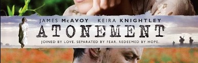 |
| Coloured segment behind the title 'Atonement' on the poster |
 |
| No coloured segment but a contrast in colours between 'Brighton Rock' and the background on the poster |
It is critical to remember that this technique is not used in 'Brighton Rock', yet the titling is still bold. I find it interesting that they all differ perhaps showing that one of them (assumed to be 'Brighton Rock', challenges typical media conventions). Adding to the bold font is the contrast in colours particularly shown in 'Brighton Rock' where the white font is contrasted over the black background. We developed this convention by using desaturated grey and yellow with white on our film poster and I think we have developed the convention to a large but subtle extent.
 |
| A comparison between the contrast in colours in the titling in 'Brighton Rock' and our 'Blind Faith' poster |
The second convention found on most film posters is the name of the actors. The name of the actors tend to appear on a film poster, this is particularly true where the actors are considered to be well-known. In this case, the actors names appear in a large font perhaps even decreasing in size as they become less popular. As shown in 'Atonement' both actors names are in large text - with surnames even in bold - to 'show off' the actors who star.
| 'Atonement' - name of the actors |
It is also common that the most well-known or the protagonist will begin on the left or at the top decreasing to the right or down. This technique may draw viewers in purely for the actors or actresses themselves. However, on some short film posters the names of the actors may not be presented as the actors are unknown as the budget is lower.
| 'Silent Things' - name of the actors |
| 'Brighton Rock - name of the actors |
It is evident from the posters I have researched that a photograph(s) of the protagonist(s) will appear on the short film poster. Sometimes being the main feature - in terms of photography - on the poster. As demonstrated in all of the short film posters I have researched, the photograph(s) of the protagonists is the most important section with everything else surrounding it in some way without too much blocking (this means use of dead space).
 |
| 'Brighton Rock' poster |
|
| 'Atonement' poster |
|
| 'Silent Things' poster |
Within the short film posters I have researched, a tagline is used in one, 'Atonement' this suggests that a tagline is not a convention of a film poster, although, it is, as shown from Maisie and Megan's research. We chose to use this convention as from external research we had found that films do tend to use a tagline in their poster. The tagline usually consists of a line from the short film or has some contextual meaning about the setting, plot or narrative. As this is revealed, some information of the film is given away distracting the smallest amount from enigma, but making the audience want to find out more, therefore creating a new enigma.
A billing block is used in every poster, whether it be a short film or a feature film. Within the short film posters we have researched a billing block is used in all of them and is attempted to appear as subtly as possible. The billing block is conventionally placed towards the bottom of the poster to ensure it does not distract from the more important features e.g. photograph and titling. As shown in the posters I have researched the billing block is also displayed in an inconspicuous colouring and font, yet not diverting from the colour theme throughout, as shown in 'Silent Things' with the billing block still being beige. Below or alongside the billing block may be a website which gives more information of the film.
Reviews and ratings are considered very important by film makers as they (hopefully) promote their film and give information of the quality of the film. It is conventional that the reviews will appear above or below the name of the company that gave the review and usually consist of a few words to a phrase. This is shown in 'Brighton Rock' with examples being "A MASTERPIECE" and "THRILLING". Looking at ratings the information given is mostly a crest naming an award the film has won or a star rating out of 5. These techniques are used in all of the short film posters I researched with 'Silent Things' demonstrating the awards within the crests.

Our Short Film Poster
With our short film poster we decided to use the conventions of titling, making our title
the most prominent text on the poster, with a bold font and subtly contrasting colour to the background. Another similarity between our short film poster and the real posters is the convention of the title being clearly visible, although our font was bold it was still very easy to read and see. Conversely, a difference between our poster and real posters is the conventional positioning of the titling. The titling tends to be near the centre as shown through two of the short film posters I researched. Looking at the short film poster Maisie and Megan researched, not all of the titling in their short films was towards the centre either. We decided we would challenge the convention of title positioning to create an ambiguous effect as created with 'Brighton Rock' and 'Purge'.


The convention of using the actor's names within film posters is one we used. We challenged the convention of making the names of the actor's large as we did not have any well-known actors playing any roles. For this reason, we decided it would be best to keep both names the same size. We also used the convention of the protagonist being the above the second protagonist with the actors names so we had Jack Bumstead above Katherine Hastings as his role may be considered larger. This also contrasts with the name of the film suggesting that Katherine Hastings' part was bigger, creating an enigmatic impression. In every short film poster I researched as well as Maisie and Megan's the actors names' were included despite the idea of the actor's names not appearing on short film posters.

We converged to the convention of using an image of the - in our case - two protagonists as our main photograph on the poster. In our poster there was more than just one photograph of the couple, however, suggesting we developed the convention to suit our film and relate to the mise en scene within it. We also used the convention of fitting other information about the film around the image, using dead space. This included titling, actor's names and even a tagline, this technique shows our poster in relation to real media products. We challenged the convention of using a medium close up to close up image within our poster as ours consists of four medium close ups. As our image is in black and white this could also suggest some form of development within the convention. We used the convention of the mid angle to show no representation of power within the two whilst still relating to the films we researched.
As with 'Atonement' and '500 days of summer' we also decided to use a tagline. We used the convention of the tagline consisting of a line from the short film due to our research but we also felt this gave a nice continuity to the products we had created. Another convention that we used in relation to the tagline is by using it is an action code in relation to Barthes' theory. The tagline we use does distract from the enigma towards the ending but the audience are unaware of this and we hoped to make them eager to find out more.
As with every short film we researched, we decided to use the convention of a billing block and did position it towards the bottom of the poster. We also used the convention of the billing block being inconspicuous, but not diverting from the colour theme. Our billing block could be most related to the one on the 'Silent Things' poster as we both use the colour theme and position the billing block along the bottom of the page. We did not provide a website on our short film poster as this was not a convention in the short films we studied. Plus, we did not have a website to attach to our poster.


Looking at the reviews and ratings on our short film poster, it is evident that we used the conventions to make our poster as realistically similar to real media posters. The reviews of our short film our positioned towards the left of our poster, which challenges the convention, but are above the name of the company who gave the quote e.g. 'The Times'. We also used the convention of the review consisting of a few words or a phrase for example "EMOTIONALLY OUTSTANDING". The ratings we use, again, use the conventions of real media products, we used a crest to show we won a 'Best Film Short' award to make our poster look as suitable as possible. We could compare our short film to 'The King's Speech' and 'Silent Things'.

c) Ancillary Task 2 - Short Film Review
Real Media Products
Our short film review was in the 'house style' of the Little White Lies magazine. As well as writing the review itself we also related our review as much to one from a Little White Lies magazine as possible. This meant, we would need to be creative and take on every conventional style in terms of layout and text. Below is a screen grab from the Little White Lies website demonstrating the creativity and overall style of the graphics, etc. used within their products. As shown, the style is very much structured and has a general theme running throughout (e.g. colour and rectangular shaping).
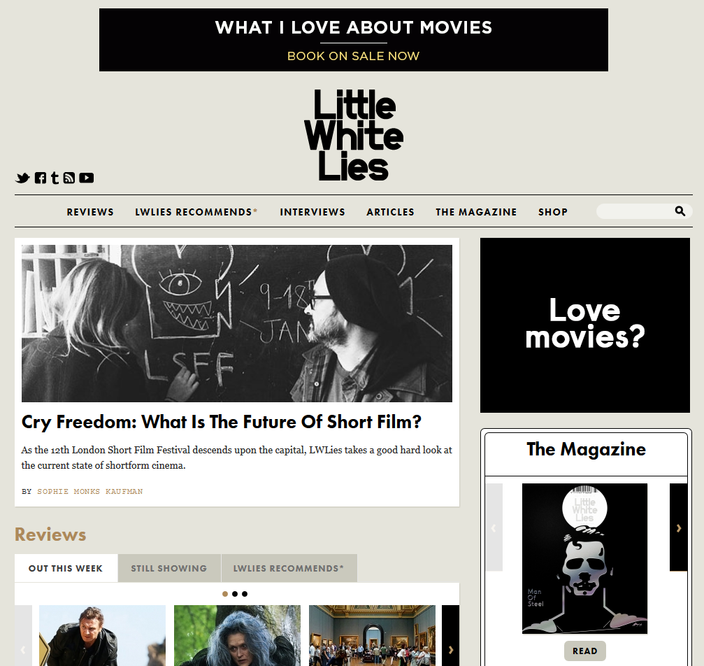 |
| Little White Lies website |
Little White Lies is a bi-monthly magazine including reviews, news on upcoming films, high brow articles on themes raised by cult and art house films. We researched the target audience of Little White Lies and discovered that they differed very much from the target audience for our short film and poster.

To relate our short film review as much to a typical Little White Lies review as possible we had to thoroughly research the language, content and layout conventions and interpret them to our short film. Below are a few screen shots showing the research we did in order to make our review realistic.
 |
| Research post into the audience of Little White Lies |
 |
| Research post into the language conventions of a Little White Lies review |
 |
| Research post into the rating system in a Little White Lies review |
 |
| Research post into the style conventions of Little White Lies |
Attached is a short video regarding the creation of a Little White Lies magazine entitled 'Black Swan'. This video really sparked our creativity towards our review and provided us with many new ideas and information in regards to style.
In regards to the layout conventions, we were given some direction through blog posts that we followed as well as being provided with a past Little White Lies Review with the dimensions and sizes recorded over the top.


The language conventions used within a typical Little White Lies Review is:
- Metaphors - used to make the review more in-depth and informal. Perhaps also used to subtly reveal something about the plot, still not spoiling the entire film, though.
- Complex nouns - used to refer to people, places or objects within the film or perhaps even out of the film giving context.
- Context - used to give the reviewer more information about the film and add to the humour and enjoyment of the review.
- Puns/remarks - used to create humour.
- Restricted code in language - used assuming knowledge from the reader, also providing the review with a more formal and knowledgable impression.
- Quotes - perhaps from the film, or again, from outside the film to provide context. It is also likely that quotes could consist of other's reviews of the film.
- The main body of the text is strengths and weaknesses - usually coupled with intensifiers such as adjectives or adverbs, this technique is used to provide as much in-depth reviewing of the film to the reader as possible.
Our Short Film Review
We have followed these conventions in order to make our review as realistic as possible. We had a list of the language conventions in front of us which Maisie and I referred to as we wrote our review. We ensured to include at least one of every convention. In reference to layout, we also had the sheet showing us the dimensions with us which we could also refer to, to allow us to create the most realistic looking review.
Looking at genre and the theories of Steve Neale and David Buckingham I would say we repeated and negotiated the conventions of this kind of product and genre. We were certainly using the conventions rather than challenging them for our review as we wanted to relate as much to Little White Lies and their target audience as possible.
In terms of narrative, it would be fair to say we used enigma codes more commonly than action codes (in relation to Barthes) within our review. We wanted to entice the reader rather than giving away the main plot behind our short film, so this meant leaving questions in the readers mind would persuade them to view our film. Bordwell and Thompson's theory also played a large role in the writing of our review, we ensured to provide a little bit of information surrounding the story of the short film with more information surrounding the less important parts of the plot. The third and final theorist we also took into account in the creation of our review is Levi Strauss. We gave away information of the binary opposition created of disabled v able and female v male. We thought it was best to refer to these two binary oppositions as they make up the main feature of the plot. This again, doesn't give too much away, but still allows the spectator to want to see more. We also thought including these two binary oppositions would be clever in that if a member of our target audience reads the review they would feel immediately drawn to view the film. This is because our target audience can relate to the ages and enjoy films of the romance genre.
2. How effective is the combination of your main product and your ancillary tasks?
Transcript
Looking
at the effectiveness of the combination of our main products and our ancillary
tasks, I feel that our portfolio would be very easily identifiable as well as working
well to complement each other in stylistic terms, for example. The poster and the
review we created as ancillary tasks from our main task of the short film help
to market and portray this and the plot behind it even further. The ancillary
tasks – in our eyes – would act as marketing and promotion for the film working
to attract an audience and their interest to find out more. It was vital we
provided the right marketing techniques to promote our film so that our target
demographic and sole purposes were reached. Pre-production we came to the
decision of our target demographic being females between the age of 15-24,
evidently we wanted our portfolio to appeal to this demographic which meant
adapting our products to their preferences.
Beginning
with our poster, we wanted the relation between this and the short film to be
as apparent as possible, meaning we would use a prop from the film as the main
imagery on our poster. The prop also acts as an image of the two protagonists
which provides even more reference to the film itself. We realised that the
poster would most likely be the biggest marketing strategy for our short film
and so we really wanted to induce the audience into watching it. The meaning
communicated in our poster is done so through the use of the de-saturated
colouring and use of other mise en scene such as the photograph prop and road
setting. This suggests that our film is perhaps to do with a girl who has been
‘left on the side’ and conveys an impression of a sinister yet ambiguous darkness.
The image of the protagonists on the photograph conveys meaning to our target
audience of a relationship to which they can relate, they can also relate to
their ages which are similar to that of our target audience. This could convey
meaning of the young girl having faith (in relation to our title) that her life
will get better and it does as this young boy comes into her life, as the
target audience can see how happy her facial expression is in the photographs.
As
the poster was our biggest marketing strategy we wanted to make it as realistic
as possible, this meant that we would have to fuse the conventions of real
media products with our initial ideas. We managed to use the conventions as
well as developing some to fit our criteria. The titling conventions were very
much used so that the name of our film (and essentially the name featured on
our whole portfolio) would stand out and be as effective as possible. The
titling typography used within our poster is also the exact titling from our
short film which meant there would be a continuation of the same font, style,
etc. really adding to our unique selling point and brand. This convention is
developed in ‘Silent Things’ where the same font is used through both products,
just different colouring. Other conventions include a photograph of the protagonists
to link with the film and a tagline from the film.
Moving
on to the representation of characters within our film poster, we were certain
use of a picture showing both protagonists would be used to generate as many
representations as possible. We wanted to create enigma in the sense of the
relationship of the characters and getting an understanding of who they are. We
used this element to make our target audience intrigued as to the characters as
individuals – with both Faith and Ethan appearing as joyous and loving
characters (with Faith being somewhat un-phased by her disability.) Coupled
with the target audience understanding that they have feelings for each other
but are unaware of the stage of their relationship. This element of
representation of character would particularly appeal to our target audience of
females between the ages of 15-24. This also relates to the themes and issues
conveyed within the poster with the main one being the relationship. It is
likely that the audience would become aware of Faith’s disability due to her
facial expression, body language and in the name of the title. This would be
considered as another dominant theme and issue which we used to create enigma
within the target audience’s mind and give away just enough of the plot to make
them want to view the film.
Furthermore,
the location used within our poster is very enigmatic and gives away little
evidence to the setting, décor and props within the short film. This aspect of
enigma in terms of Barthes’ theory pairs with the action codes to give away a
certain amount about the film, yet still intriguing the audience as to why this
location is used especially in such a close up shot size. The de-saturation of
the location also gives away an eeriness surrounding the setting; to our target
audience this would be very unpredictable and gives away little if any
information about the film. This would make the target audience enjoy the film
more as this ambiguous use of location would finally be clarified at the end of
the film and they would feel re-assured in the relation and ‘in-the-know’ about
this use of location. As aforementioned, the use of colour is rather dark and
tonal, with a de-saturated effect, these all contribute to the enigma we
intended to give the audience an understanding of, as well as them enjoying the
film that bit more when they discover the truth behind the darkness. The image
and colouring techniques paired with ratings and reviews give away evidence of
the genre of the film, without giving away too much.
The
review is another marketing campaign we made in order to promote our short
film. The review was created in the ‘house style’ of a review from the magazine
‘Little White Lies’. This meant that we may have to subvert from our original
idea of creating a specific brand, however, after researching the magazine
review conventions, I believe we managed to merge our review and the typical
style very well. It is very important to remember that for our review we were
dealing with a completely different target audience to our poster and short
film, so this, again impacted our review heavily. The target audience for Little
White Lies is 18-30 year old young professionals, students or graduates with
significant disposable income and time rich. This essentially, means a target
of males around the more specific age of 22-26 in relation to our target
audience. The psychographic is also considered to be people who come from a
cosmopolitan urban area with free time who enjoy art, politics, etc. We believe
that though the target audience is the same the review will still intrigue
readers to view our film as the readers of the magazine are keen movie and
graphics devotees. We also feel that our modern day and hybrid twist on the
genre of our short film (as stated in the review) will attract an audience from
LWL. Our review appeals to the target audience of LWL through the conventions of
the review. We used conventions of layout, content and more from the ‘house
style’ of LWL within our review so as to make it as realistic as possible with
a high quality finish. Conventions such as justification, a reviewing/rating
system and a screenshot from the film along the top centre of the review were
used. It is also important to look at the distribution of the magazine which is
even sold in shops such as Carhartt and Urban Outfitters which are two places
our target demographic may shop. This leads to the review reaching our target
audience as well as the poster and short film.
As
the review written is favourable to our short film along with the ratings
given, the general feeling towards our short film will be positive and may lead
to more viewings. Not too much of the plot is given away either which also
intrigues the audience. However, there could be poor implications if the review
were to be poor with low ratings as the viewing of our film would not be
successful. With an unsuccessful review readers of the magazine would be put
off from viewing our film and the word may spread that the film was of a low
standard. A successful review is very much a fundamental marketing campaign to
our short film, without it we would not gain a new demographic which we hadn’t
targeted and may lose views from our original target demographic. The ‘house
style’ of the content of a review in the Little White Lies magazine is written
to persuade and inform the reader. Use of linguistic techniques such as:
adjectives; complex nouns; complex sentences; metaphors and restricted code in
language all form this ‘house style’. We attempted to use all of these
linguistic methods within our review so as to use the conventions of the review
as well as informing the reader and leaving them persuaded and wanting to find
out more.
As
our short film is a low-budget, independent short film there are limited other
marketing techniques that could be used in relation to our short film. For our
short film, we would be most likely to use digital social media such as
Facebook, Twitter, etc to create a social buzz around our short film and really
promote it to a larger area both on the Internet and offline. Moreover, a
further marketing means we could make use of for our short film is film festivals
such as LSFF 2015. It would be important we attended the most popular short
film festivals in order to get our short film noticed by as many members of our
target audience and other consumers as possible.
3. What have you learned from your audience feedback?
Our target audience were females between the ages of 15 and 24. Last year Maisie and I used a target demographic of males for our thriller short film. For this reason, we wanted to differ from last year to show we could vary in our targeting of audiences and our production of products in relation to this. The psychographic for our products are females who enjoy romantic films stereotypically 'traditionally represented' females. Our products were designed to appeal to these audiences by use of characters they could relate to both through age and personality. The products we created were unique and persuasive towards our target demographic, being bold and colourful with our desired effects. The idea of Faith being blind also generates sympathy and empathy within the demographic.
The target audience we chose in our foundation portfolio was very much suited to our group. This was due to the fact that our group was predominantly made up of males. Also, we had a wide age range within our group in relation to this target demographic. Luke was 17 and Maisie and I were 16 which gave us an upper hand on understanding the demographic a bit more.
As our short film this year is a romance and social realism hybrid I feel our target audience was very easy to access and converse with due to our friendship group being members of the target audience mainly female. The themes and issues and narrative within our products also meant we could connect with our target audience very easily due to the demographic stereotypically enjoying romantic films.
We received lots of feedback on all of our products, below are images of the websites and software we used in order to collect feedback from our target audience and others.
Ways we collected feedback

Using the social networking site Facebook we could interact with our friends who are all around the same age as us (therefore a member of our target demographic). Also, over half of our total friends were female meaning we could get lots of feedback from females of different ages within our demographic.

We were also able to use the website Blogger to allow us to gain feedback from our teachers as to how to improve or any corrections that needed to be changed. It is also useful that other media groups from our class, year group and even the AS year can view our blog and give us feedback on what to improve or what they liked.
 Another website we used to collect feedback was Survey Monkey which allowed us to collect feedback presented in charts, showing the amount feedback given and opinions on each question. By asking friends both on and offline we managed to generate a fair amount of feedback which helped us very much in our production of our products.
We used messaging in forms of Instant Messaging on Facebook and text messages to receive feedback also. Texting allowed us to send images of our products to our target audience, which Survey Monkey couldn't. This meant that our feedback was more in-depth and as it is through texting, feedback is personal rather than just the answering of a few questions.

Another feedback method we used was E-mail, we used this, particularly with our teachers and media technicians in order to gain feedback on what we have created. Either this, or we would gain feedback on how to improve or certain information about how to do something on a programme, which Ollie and Sophie helped with. This was a very effective feedback form and saved us time by not visiting the media suite at any stage we needed feedback or assistance.

The final form of feedback we used was conversation. It was easy for us to approach members of our target audience by simply speaking to them and it was simple to record down their quotes. I would ask if they had any thoughts on our product, what they liked, what we could improve. This form of feedback was much more candid and really allowed me to get an understanding of their thoughts rather than just via text. I could also generate idea from their facial expression which helped a lot.
Research and Planning (Pre-production) Feedback
Survey Monkey


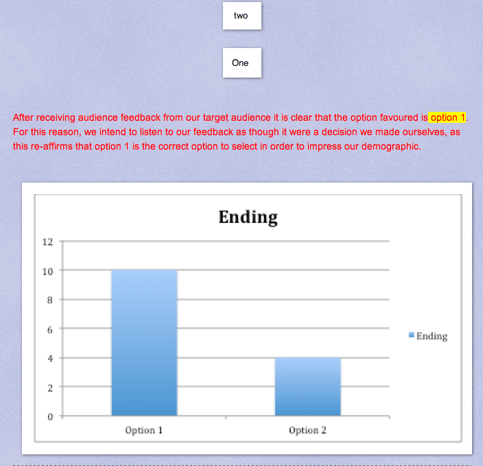
We chose to listen to our target audience for the obvious reason that we would have to make our short film appeal to them as much as possible if we were going to be successful. We learned from our feedback that Blind Faith was most popular with members of our demographic, plus re-assurance from our teacher ensured we made the correct decision in our name.


We reflected upon this feedback by posting a thank you on Facebook to everyone who had posted after we had shared the link. We then fed back to our target demographic that the name chosen was 'Blind Faith'.

Below are screen grabs from previous posts in relation to the research and planning of the ending of our short film. We collected feedback on a preferred ending via messenger and implemented this feedback to direct our film. We then went on to create our storyboard and adapt our synopsis and script.


Short Film Feedback
Facebook
We used Facebook for feedback on all of our products.
Our short film post on Facebook did not receive any feedback, only 'likes' for this reason I took to messaging the members of our target demographic who had liked the short film and asked them for some feedback, below are some screen grabs of important feedback we received.

 |
| Response number 1 |
This feedback was very useful to us and our short film in saving time for more important scenes. We made alterations to our short film after hearing this comment by removing some of the conversation between Faith and Ethan at the start. We wanted the spectator to get an understanding of them building a relationship and thought a large amount of language would achieve this. However, it soon came to our attention through this and from conversation feedback that this was far too long and got rather boring. By saying she liked the ending this member of our demographic really helped us in feeling re-assured and confident in our post-production, editing and filming of the most vital part of our plot.
| Response number 2 |
 |
| Reply |
| Response number 3 |
Of this feedback we chose to disregard parts, the whistling in the canteen setting we could not do anything about in post-production so a change would involve re-shooting that entire scene which would have been wasted time and meant we would miss the deadline. We learnt from this feedback that some background noise is ok as long as it provides a reason, e.g. establishing the setting in Brighton.
Text Messaging


Here's some feedback from our actress on how she though the overall filming went and what she thought of the outcome. We could not implement this feedback after collecting it as this was after we had fully edited the short film. Perhaps if we had collected feedback from our actress earlier on in the planning and research process we could have changed the synopsis and script.
Conversation
"That's so good, yeah I really like it"
"WOW! haha"
"Oh my goodness! How did you do that?"
What did you like the most?
"I really like the ending, obviously, as it is so dramatic and cool, I don't know how you did that"
"I loved the ending it looked so cool. I also liked the idea of the main girl being blind as well though"
"The whole thing was great but I liked the end and when the girl said that last bit"
Is there anything you would change or would have done differently?
"Um, I would maybe change the voiceover in the woods as it doesn't really sound like the woods"
"Not really, I liked it all!"
"Um, I did really like it, but, I probably would have made the girl being blind look a bit more realistic"
We would have loved to implement this feedback and this feedback did come back more commonly than other criticisms. However, we were under time constraint to finish the film and re-shooting the entire wood scene would have been very time consuming and we wanted the idea to be that they were speaking from heart to heart. We also felt that our actress was great at following direction and played a very believable blind person. Again, to make the female protagonist appear more realistic we would have had to re film all shots the person feeding back though the actress looked unrealistic in. This would take too much time for our deadline. This feedback did however provide us with information that meant perhaps we would need to give more direction to our actors in the future.
Short Film Poster Feedback
Facebook
Below is a screen grab of a post I uploaded of our poster asking for feedback. I first uploaded my first draft of the poster as shown below, the feedback we asked for had to be critical so we mainly received negative feedback, with positive feedback mostly being 'likes'.


Final draft of Poster post on Facebook. We received no drastic ideas for change here, and all comments were not critical. Just saying that the poster looked much better now. The likes shown on the photo also demonstrate how we have appealed to our target audience and the poster is preferred in this way.

As you can see here from this post, I implemented the feedback I received and I justified our poster for these reasons.


We used this feedback to make alterations to our short film poster. We changed the poster in the ways our target audience told us to, so that our final product would be as successful as possible. We learnt from this feedback that every member of our target audience understood what we were trying to convey through our poster for example with the titling.
Blogger


We used this feedback for obvious reasons as it would help us do as well as we can. This is the same with all of the feedback we received from our teachers and media technicians.


From this feedback we have derived that our target audience think that the poster needs more information of what the film is about. However, we had to disregard this feedback so as to not divert from the conventions of real short film posters. Plus, more text may distract from the main ambiguity and imagery we used within the poster. We had hoped that the tagline used would provide enough context and information of the film to persuade our target demographic to view our film. We learnt that information was key to persuade our audience to view our film. The review we created fills this requirement, which shows the benefit and success of our portfolio working as a whole.
Short Film Review Feedback
Below is a screen grab of the feedback we received for our review. As you can see we did not receive much feedback, again, via the post. Therefore, I got feedback from our target demographic and people who 'liked' the post via messenger.


This feedback is very positive and so there were no changes suggested to be made by our target audience. I assume this is because we worked really hard on ensuring our review related as much as possible to a Little White Lies Review, which our target audience would probably also enjoy. It is nice to learn from this feedback, however, that our target audience found the review "well written" and exciting, this shows our target to persuade the reader to view the film has worked. This is clarified in "can't wait to see the film!!! :)".
E-mail
E-mail was used massively in the creation of our review where we received feedback from our teachers on who our review was written. We also received feedback from the media technicians Ollie and Sophie on how to use inDesign if we were confused or needed any assistance. The feedback given from both teachers and technicians was vital in producing a review to the highest standard possible and so we implemented every idea or advice given to ensure we were on the right track to a successful review.
4. How did you use new media technologies in the construction, research and planning and evaluation stages?
Please click on the Prezi below to activate it.

Good to see that you've started this Jack, and there's enough to get a sense of where you're going.
ReplyDelete- you need loads of images, links, embedded video, obviously.
- on transitions - you have used many jump cuts yourself, and I think this more experimental type of editing is found frequently in short films, where directors show what they can do in terms of being less mainstream
- narrative - needs more reference to theory and adaptations of standard structures, found often in short film
- analysis of genre needs to be clearer, with more examples. You need to use theory more precisely.
- character - I don't think overall that stereotypes are used often in short films, unless they are quickly demolished. Look again at the examples your whole group analysed earlier. This is another point too - don't rely entirely on your own research (this was group research), as it starts to look like you only know a couple of short films!
- themes and issues - these are incredibly varied in short films. Compare with mainstream, where it's much more limited.
We've taken the poster here as the final one, and assessed it as very high level 4 - so very well done!
ReplyDeleteNothing to do on that!
Review - some improvements recommended here in the final window before marks sent off:
ReplyDelete- look again at the column width - yours appear to be too wide? Can you check the frame size you were working from - is it correct? Also, you need to include the drop cap at the start - 3 lines as in LWLs. Check font size too - yours appears a bit too small? Can you also move the ratings slightly to justify with the column edge on the right?