Maisie, Megan, Jack

Maisie, Megan, Jack

Thursday, 27 November 2014

Poster Research - Brighton Rock

Poster Research - Brighton Rock


Analysis

The names of the actors do appear within this poster, they are under-stated and accompanied by images of the actors who are in character. Main text is positioned in dead space of the image over the background of the sky. Interestingly, there are references to other films and one of them is 'Atonement'.
The main image is of centralised around the characters however the Pier setting in the background provides context. There is no tagline on this poster, however the cultural reference of the Pier gives an


Ratings and reviews of 'Brighton Rock'
idea of context. The poster also has a website positioned under the billing box in addition to critics praise above the titling. The titling itself is larger than any other text on the poster and would appear to serve some purpose of relation to the film. The billing block used is generic and barely compliments the design, the only use it makes is as a filler for dead space in the background. The age certification for this film is 15 which is shown alongside the billing box. Although, there is no release date advertised.


Media Language
  • The poster makes use of low-key lighting along with dark colouring of setting, location and props.
  • The costumes, hair and make up of the characters are ranged from bright to dark and insinuate a 1930's impression.
  • Canted angle of the medium long shot at low angle perhaps sets out the ambiguity of the plot.
  • The titling used in this poster is very formal and rather basic, in both font and colouring, however, they do both contrast very much with the image on the poster.
  • It could be considered pathetic fallacy is being used here, perhaps as a manipulation of time as the sky changes from light to dark.
Representation

  • The use of low-key lighting and dark colouring creates the representation that Brighton is quite a dark and sinister place.
  • The red colour in the female's coat (to the left of the male) creates the representation that she is  perhaps a dangerous character or that she could be in trouble in some way in the film.
  • The canted angle of the shot creates the representation of ambiguity and enigma within the film.

Red colouring shows danger


Audience
  • Looking at the film poster, I would assume that the target demographic of the film is both males and females of around the age of 25 - 40. The genre of the film is thriller and crime which could draw in a younger audience. However, I believe that because the film is set in around the 1930s people of a more mature age would appreciate the plot more.
Narrative
Titling creates enigma in what the film is about
  • It is difficult to tell just from the poster what narrative structure this film will follow. By the looks of it, the film appears to follow a linear narrative. The poster also portrays a sense of a plot which involves the three protagonists and involves a crime, in terms of Bordwell and Thompson's theory. In reference to Barthes theory a few of the enigma codes here are the characters, the lighting and the titling (both name and font). The action codes are the pier setting, dark clothing, etc. The main binary oppositions created, looking at Strauss' theory are, male and female and dark and light.
Genre

Rick Altman
  • Semantic codes - Setting, props and decor along with clothing, hair and make-up are all iconographic of the thriller and crime genre, being formal in style and dark in colour. The shot size and angle used within the poster is also iconographic of the thriller and crime genres. As the shot is in a canted style it adds to the mystery of the genre. 
  • Syntactic codes - The binary oppositions used are again stereotypical of similar films of the same genre. Additionally, the stereotype theme used is generic, with dark and sinister characters who portray a sense of mystery.

David Buckingham and Steve Neale
  • Whilst it is very difficult to apply these theories to the film poster I would say that it takes on repetition of film posters of the same genre. Also, the font of the titling on the poster might show negotiation, change and variation in that it could be rather more 'creepy' to convey the genre as much as possible.

Tuesday, 25 November 2014

Poster Research - The King's Speech

The names of the actors appear above and below the title, the three main actors having slightly larger fonts than the rest of them that are listed. Only two actors appear on the image and look as though they are in character, and their names appear on the same sides of the title as they do. The images of the actors look as though they've been placed over the main background. The text is centered and placed towards the bottom of the poster, and it's superimposed over the image, whereas the billing block is placed at the very bottom of the poster. It's still centered and there isn't a lot of it so it doesn't draw attention away from the image or the title. At the top, above the ratings and quotes from The Daily Mail and Company, it says 'The nation awaits...', implying both the content of the film and the actual country waiting for the film to be released.

Media Language
The lighting behind the actors is quite low key, but in front of them around the statue is high key, suggesting that there is a bright future. Their clothing of the actor on the left shows he is of royalty (clearly the king) and the actor on the right is not of royalty, but of a high class. Linking to the 'bright future', the facial expression of the actor on the right shows he is confident and optimistic, whereas the expression of the actor on the left shows he is nervous, suggesting something about their characters. The title has a 'shiny' look to it, almost as if it's made out of gold, which suggests wealth, and the crown on top of the 'i' continues the theme of royalty.

Representation
This is clearly a positive representation of royalty and high class; the actors clothes are pristine and their surroundings look very grand, much like a palace. Also, the fact that the two actors are male represents the era in which this film is set, which was during the 30s and before the 1975 Sex Discrimination Act.

Audience
The audience for this film will mainly be adults, as the younger generation would not understand or know much about the history behind the characters or the actual story. They would be around the 30 - 45 age group and would be from standard class and above, as cinema tickets aren't usually cheap. People that would watch this would be interested in the history of the country and it's rulers.

Narrative
Unlike the other posters, this one shows more about the content of the film. The background shows a huge crowd of people gathered around the statue of Queen Victoria (the setting then obviously being London). The actual shot is from inside Buckingham Palace as the king is waiting to go outside to give the speech, hence why the crowd is there and why the tagline is 'The nation awaits...'. Applying Levi-Strauss's theory shows that there are some simple binary oppositions. The two main characters are positioned so they are almost 'above' the crowd outside the doors, which links to their status in the film. This is a clear demonstration of wealth and working class, as were a lot of people in those times.

Genre
Judging by the lighting, the facial expressions of the actors and the justification of the text and how ordered it is, the audience can deduce that it'll be some sort of drama. Also, mainly because of the title and who the characters are, it is also a historic film that educates people about a certain topic, and also biographic as it's about someone's life.

Monday, 24 November 2014

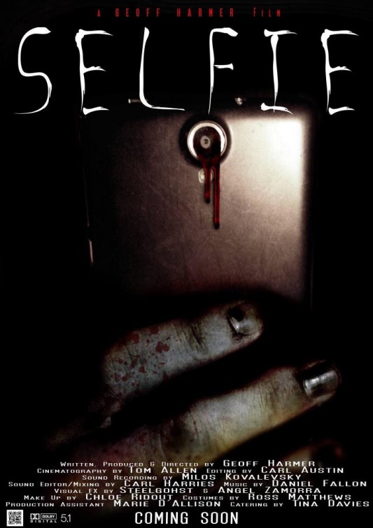
Poster Research - Selfie

Selfie Short Film PosterOn this poster, the names nor images of actors are not shown, not even in the billing block, which is very standard and the text doesn't quite match. The text and imagery overall is very minimal, and doesn't give much out to the audience. The title of the film is the largest text on the image and is placed at the top above the image, but the lighting is so dark that it's unclear if the title is either on top of or separate from the image. The image itself is quite self-explanatory, even though there are no images of the characters/actors; the phone links to the title and the blood suggests violence and/or gore. There is no certification, but judging by the fact that the imagery contains blood and has a general sinister look about it, it would more likely be around a 15.

Media Language
The main image shows a phone in very low key lighting, immediately suggesting a sinister atmosphere. The blood dripping from the camera then implies that there will be some kind of injury or death, adding to the dark and sinister genre, then the hand holding is green in colour with black nails, which suggests some supernatural undertone.
The word 'selfie' is a very youthful word, so it therefore shows that this film in involve teenagers. The actual lettering of the word is very harrowing and sketchy, bringing out the horror element.

Representation
The combination of the horror genre and the almost comical word 'selfie' is like a juxtaposition, in a way. It's almost suggesting that this seemingly harmless action is potentially lethal, which actually then counteracts the horror element of the poster and film as a whole.

Audience
Usually, the audience for these kinds of films are people who like horror films and that genre in general. This poster looks quite low budget; the title font is repetitive, the billing block font doesn't look right and there is no other information around the image. The audience for this would possibly be around the 16 - 24 age group, as it's usually teenagers and young adults that enjoy horror films, and also the fact that teenagers can react and relate to this situation of taking a 'selfie', linking back to the youthful aspect.

Narrative
The narrative and chronology for this short film is, again, unclear, however the audience can pick out what may or may not happen from this poster; the camera dripping blood could signify that taking a picture could be lethal.

Genre
The genre of this film is extremely clear; the font, the lighting, the image, the colour all suggest horror. The way that all of these factors are presented shows that this short film is of the horror genre. Altman's theory could easily be applied here, despite the fact that there are so little semantic codes. The blood signifies death, the discoloured hand suggests unnatural happenings and the low light implies fear, which are all common codes featured in the horror genre.

Monday, 17 November 2014

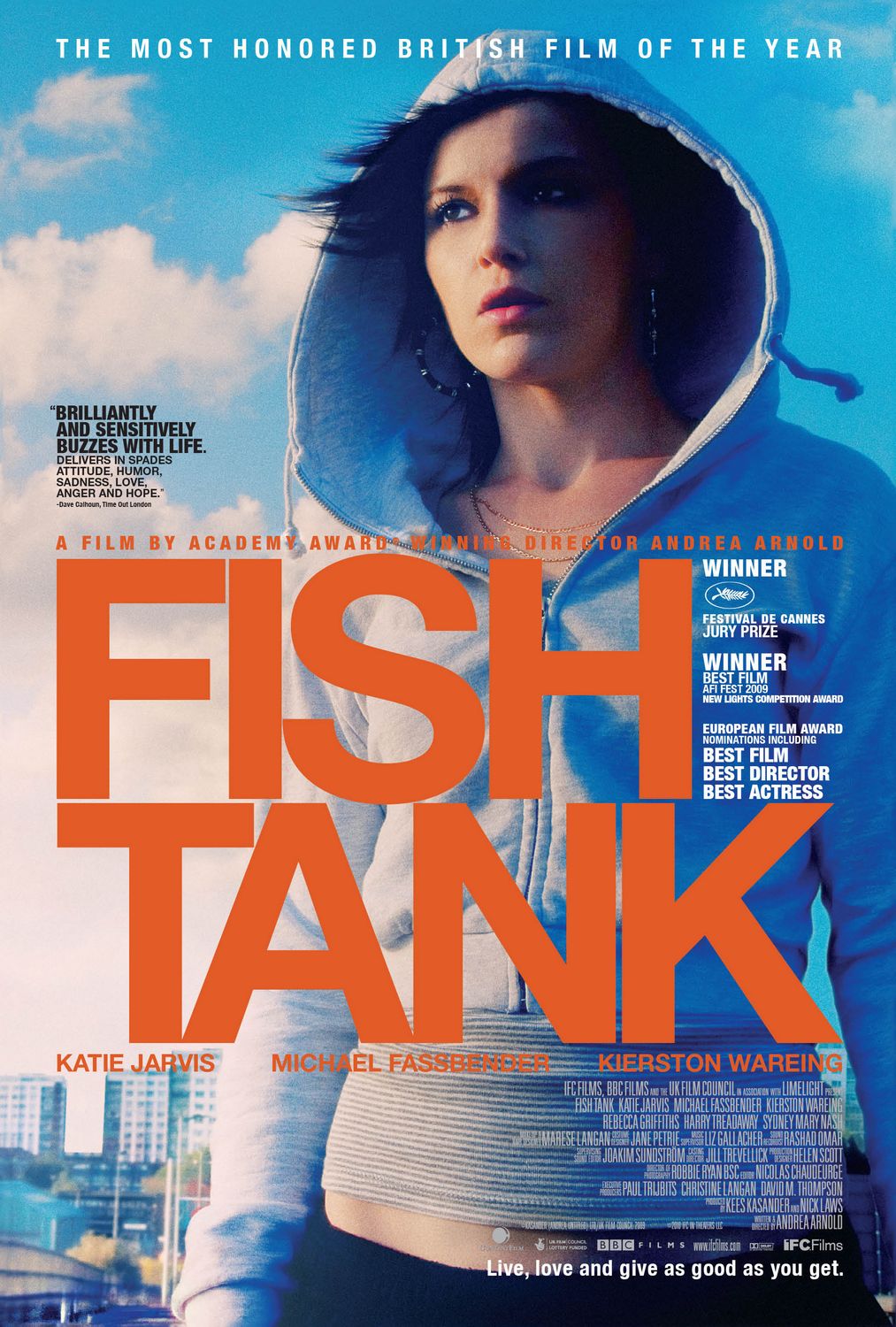
Poster Research - Fish Tank

Extra Large Movie Poster Image for Fish TankThe names of the actors appear beneath the title in the same font and colour, however the images of the actors don't appear, because it's only one image as a whole (possibly the main character). The text is placed over the top of the image and as the main image is slightly to the right, the title is over some of the background. The title itself is the biggest text on the poster, whilst the other information is in much smaller text. At the bottom of the billing block there is a website and it's for IFC Films. There is only one quote and it's from the magazine Time Out. The billing block is juxtaposed to the right, mainly because the text is white and stands out against the darker part of the image.

Media Language
The lighting from the left side creates a deep shadow on the right side of the character's face, suggesting drama. Her facial expression shows that she is looking at something or has seen something, and this adds to the drama and tension being conveyed in the image.
Stereotypically, her clothing implies that she's around the South London area, which is known for being quite suburban and working class, so the income is low therefore her clothes won't be at the top of the market. She is wearing a cheap-looking hoody that is slightly open at the neck, suggesting that she is confident in herself and wants to be noticed. This can be seen behind her in the background, with high rise flats and terraced buildings, typical housing for that area of London.

Representation
Similarly in media language, the character is shown in suburban London. That area is known for being quite rough and shady. This could therefore represent the female character as being quite rowdy and forward, which is demonstrated in her stance and clothing.

Audience
The audience for this film is ambiguous, but could be of a similar class as the character depicted on the poster. The age would be around 20+ judging by the look of the character, but without knowledge of the actual content of the film, a specific age cannot be identified. However, tickets to see the film would be relatively expensive, so people of a class with moderate income would also be able to see it.

Narrative
The lighting and her facial expression suggests that something dramatic is going to happen, or has already happened, so the narrative of the film could be something to do with this girl's life and what happens in it. The chronology of the film is unclear, but the audience can assume it's linear. Using Todorov's theory, is it clear from her stance and her expression that the story is in stage 2 of the model, also known as the disruption; her face shows concern, which could be significant.

Genre
Again, the genre of the film is unclear, but it can be deciphered from the image and tagline; "live, love and give as good as you get", as it suggests possible romance and drama. If Buckingham's theory were to be applied, it was obvious that this was breaking the stereotype; most posters would have a strong male character displayed behind the title. This however shows a strong female lead, which therefore shows that attitudes towards women have changed over time, meaning that this film will have a large feminine atmosphere.

Poster Research - Atonement

Poster Research - Atonement


Analysis

The names of the actors do appear in this film's poster. They are rather prominent and are composed just above the title justified to create a sense of formality. The images of actors within this film also appear on the poster, both of whom are in character within a setting from the film. Main text is kept away from the subject of the images however, dead space is filled with the text. The dead space within the images is setting and background of the photograph which is primarily out of focus due to the shallow depth of field. The main graphics of the poster consists of two main images of which both show the characters. Within this short film there are references to another film and a book, but there is no website. Cultural references and a tagline are both used within the poster showing context of the war and generating an enigma in the spectators minds. Surprisingly, there are no critics praise for this film, neither words or ratings which could suggest that the film did not receive outstanding or pleasing reviews. Looking at the title on the poster, it is larger than any other text on the poster. The font style and colour does reflect that of the film itself which has a semantic field of war, therefore the typewriter text and smudged effect reflects the genre. There is a billing block at the bottom of the poster in the centre which is generic of that of an ordinary film poster. Although there is no drawn imagery on the poster, the image of the characters are placed over a photographic setting. The poster does reveal an age certification and provides a date of release though these are both understated and discrete.

Media Language

  • Close ups are used for photography of both characters.
  • The photographs are both mid angles.
  • The colouring is saturated and very bright, the lighting is also high-key giving an overall vibrant appearance.
  • Setting, props and decor are all kept very minimalistic within the poster and create enigma.
  • The costume, hair and make-up are very old-fashioned and considered iconographic of a film of the war genre.

Representation

  • The close up shots at mid angle used create a sort of symmetry between the characters as well as creating an intimacy between both characters and spectators.
  • The colouring and lighting used suggests a light and up-beat theme to the film, subverting from the evident darkness of a film relating to war. The grey line between the characters in which the title is positioned, however, may act as a representation of darkness and dull times between them.
  • Settings, props and decor used create the representation of a time where chintzy items are minimal, perhaps as they are rationed. This is not only enigmatic but also acts as an aid of war portrayal.
  • The costume, hair and make-up used within the poster create the representation of the male being at war and the female perhaps being rather middle to upper class. The exact stereotype of a partnership who were around within the years of the law.
Audience

Looking at the poster as a whole, one could assume that the poster is aimed at a demographic of middle class around the ages of 25-40. The gender demographic is difficult to consider as the war theme targets males, though the romance area targets females. The demographic would have a specialist knowledge of the war in order to get an understanding of the film to the highest extent.

Narrative

The narrative within the poster suggests very little, it is suggested that the film takes on a linear narrative. The narrative used also acts as an enigma code as well as an action code in many ways. One could assume that the poster conveys the film to repetitive of that of similar film story and plots.

Genre

The genre can usually be revealed rather easily by the poster of a film. This poster reveals the film to be a hybrid of perhaps action, drama and romance genres. Rick Altman's theory of semantic and syntactic codes can be used cleverly within the poster in terms of semantic codes. The semantics of the bright lighting and colour as well as other mise en scene - such as facial expression, costume, etc. - suggest the genres of the film.