
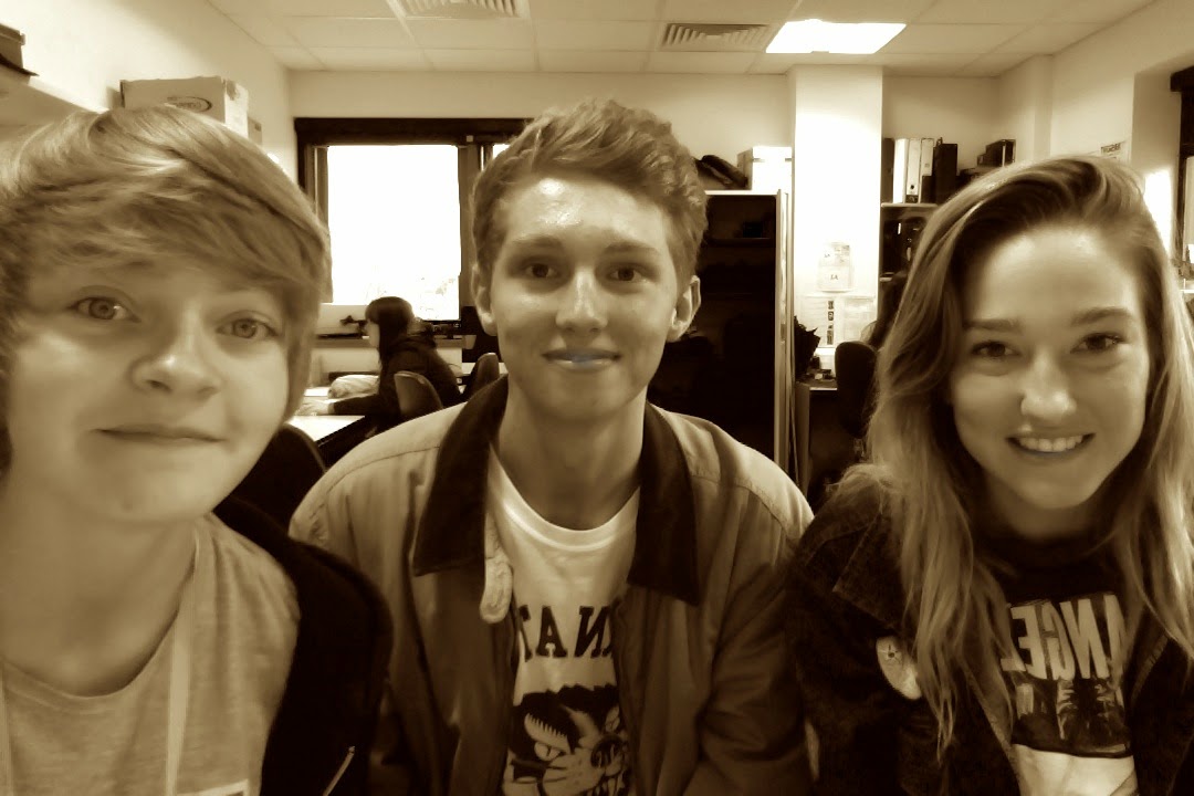
Maisie, Megan, Jack
Tuesday 5 May 2015
Thursday 5 March 2015

Wednesday 14 January 2015
FINAL FILM
After reaching the deadline for the short film we realised that towards the end of our film an editing error had occurred in relation to the credits as the end. We have now made alterations and our film has been re-uploaded to the blog in this post.
Monday 12 January 2015
Evaluation.com
1. In what ways does your media product use, develop or challenge forms and conventions of real media products?
The Main Task- The Short Film
To begin with, camera work can be varied throughout any short film depending on the genre of the film i.e. close ups may be used to show a romance and/drama however close ups also may be used in a thriller film to create suspense to the audience. In our short film, many of our shot ideas were taken from other short films that we watched that included the same genre as ours- drama.
 A short film that I researched when we got the basis of out storyline was the short film 'Touch.' This short film has a drama/romance genre like ours. An idea that i got from this short film was the idea of using close ups/ extreme close-ups to demonstrate intimacy throughout the film.
As you can see from my description that I completed just as we were planning our film, I talked about how the close-ups of hand touching gave the impression of a love ever-growing- an idea that we wanted to incorporate into our film showing our two main characters (Ethan and Faith) growing closer throughout the film.
To the right there is some screenshots used to show intimacy through hand touching- an idea we got from the film named above-touch. The use of close-ups/extreme close ups show love growing stronger.
Another idea that was influenced by the film touch was the idea of using non-dietetic music to set the scene. Using this idea as sound can be much more meaningful to the audience rather than dietetic sound being used as it can create a mood.

When I evaluated this film, I talked about how with the use of non-diegetic music being used we are able to have emotion conveyed to the audience through facial and body expressions from the two characters rather than words.
An idea that we had for our diegetic sound starting from 3 minutes was using a voice over. Voice overs aren't common in many short films however we thought this would be the right thing to do as it sets and under-tone for our film and sets more of a darker feeling- suggesting darker things are to occur later on in the film. The sound we used made it sound echoey- an effect we wanted to use as we felt it makes it stick more in your brain and makes it seem more creepy and suspenseful.
Mis en scene is a main part of any film as it is used as iconography to show the genre or the location etc. For example, in a restaurant having the typical things of tables, chairs, menus, waiters etc- without these the scene may not be set properly and the scene won't be as believable, i.e. if there is a bed in the restaurant. Mis en scene will also relate to the time period that the film has been set in- if this is a film set in the 50's then obviously we wouldn't see the use of mobile phones or high class televisions but rather props will be used to correlate with the past time rather than the present.
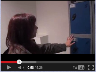
As well as props, mis en scene also includes outfits, hair and make up to set the character up to be believable. An idea of this is shown in the film 'Connection' a short film I researched into showing class. However, the idea that I will be showing is the way the character is dressed.
From this image we can tell straight away that the character is much poorer- no shoes on and dressed in a sleeping bag as well as sitting on the street corner. This is due to the mis en scene used.
Our main protagonist, Faith, is shown to have a disability so therefore her outfits, hair and make-up need to be set up to show this.
From one of our first shots of Faith we are able to see odd shoes- maybe suggesting blindness or non care to her choice of outfits. As well as this the prop she is using- a blind stick- is used to point out her disability even more. This shows that mis en scene is needed to set up a character to be portrayed to the audience.
Editing/post production is the main part of creating any film. This is needed so we can put shots together in the correct order and use transitions to change from scene to scene without noticability to the audience.
 Something that is used in many film is the editing process to make it seem as if time is passing, This can be used through fades, cuts or speeding up of the shots.
Another example from the film Touch is the idea of using an ellipsis to show time passing- i.e. the space of years passing by in only a couple of seconds on screen- this process is used to show time passing without showing unnecessary detail in between that has no use to the actual storyline and isn't needed in the plot.
The idea we used to show time passing in Ethan and Faith's relationship was the idea of speeding up the shots to show time passing. We used a commonly used idea in many films with speeding up cars going past to show time moving without needing to show what was actually happening as it was irrelevant to the storyline.
Another idea of post production editing that almost every film uses is the idea of editing the titling text into the film. Our title 'Blind Faith' was cleverly edited into this scene that we filmed originally. We edited it in so it appeared behind the character as she was walking along.
Steve Neale and David Buckinghams theories helped us to decide to repeat some conventions of the genre as that's what other real media products had done. We also decided to challenge the conventions by creating variation in forming a hybrid of romance and drama genres.
To begin with, our main character Faith has a disability, this is something that most people that are able-bodied can sympathise with. We are able to gain sympathy through showing her difficulty coping with her disability and the way she is bullied for it.
Bullying is a subject that some of our audience may be able to relate with and therefore can relate to our main character. This shows that our audience have been able to make a connection and feel sorry for our character right from the beginning of the film.
As well as this, our plot follows through on some sort of journey, a journey on the relationship building between our two characters Faith and Ethan. This may include the climaxes and anti climaxes as we expect parts of the film where they become together, hold hands etc. however there is always an anti climax when there is a missed opportunity.
One typical romance/drama convention our film doesn't follow is the idea of a happy ending. We thought that we would change our storyline around a bit to make a dramatic ending that completely shocks the whole audience and this is done through Ethan's death. This is unexpected as the audience would expect Faith to be the one to die due to her being blind.
The genre codes to a drama to conclude is that it is somewhat social realism, and the characters are emotional and you (as the audience) are made to understand the emotions. Therefore to conclude we have stuck with the convention of sticking to the popular genre of Drama with our short film.
As for the narrative of the film, we tended to stick to a linear narrative as it is much simpler to follow. One reason we used a linear narrative is that we were using the idea of following a love story of simplicity rather than confusing the audience. As well as this, we thought that a linear narrative would keep the audience more in tune with our characters and understand them more as the story went along in the right ordered time.
We used the idea of having restricted narration throughout our film to create suspense to the audience. The short film Touch is also another short film that used restricted narration in order to keep the audience guessing.
Another narrative theorist that we can relate our film to is Strauss and the idea of binary oppositions. These oppositions include Boy Vs Girl (Ethan and Faith) Good Vs Evil (Bully and Ethan) as well as Able bodied Vs Disabled (Ethan/bully and Faith)
Characterization links into the character profiles I created for the two main characters back in October before creating the film.


I think we were able to portray Faith stereotypically how a blind person would be displayed in a film- the disability is usually shown negativly however this is used to gain sympathy with the audience which I think we were able to do. I wrote how Faith used to be an outgoing character before her lose of sight and I think throughout the film we were able to see Faith become much more outgoing around Ethan than she was when she first met Ethan.
As well as this, I think we were able to keep the mysterious vibe around Ethan. He doesn't say much in the film about himself but only talks out when talking about Faith or with Faith. We don't seem to find out much information about him throughout the film.
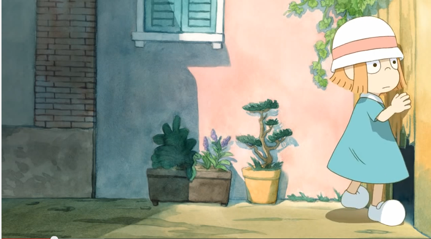
Many Themes and issues are used throughout short films to create a connection to the audience or create a meaning to the film. We have represented the theme of disability in our film. As well as this, we were able to use Strauss's idea of binary oppositions of gender to create an issues in modern day time. This film (out of sight https://www.youtube.com/watch?v=4qCbiCxBd2M - one title idea for our short film) is an animated short film that portrays blindness as a disability in a positive light. Even though this is an animated film and ours isn't, we can see the conventions are the same in portraying a blind person. We felt that disability was a theme that we would be able to portray very successfully and turning it into a romance/drama genre which i think we created.

A short film that I researched when we got the basis of out storyline was the short film 'Touch.' This short film has a drama/romance genre like ours. An idea that i got from this short film was the idea of using close ups/ extreme close-ups to demonstrate intimacy throughout the film. |
| Our film example |
As you can see from my description that I completed just as we were planning our film, I talked about how the close-ups of hand touching gave the impression of a love ever-growing- an idea that we wanted to incorporate into our film showing our two main characters (Ethan and Faith) growing closer throughout the film.
To the right there is some screenshots used to show intimacy through hand touching- an idea we got from the film named above-touch. The use of close-ups/extreme close ups show love growing stronger.
Another idea that was influenced by the film touch was the idea of using non-dietetic music to set the scene. Using this idea as sound can be much more meaningful to the audience rather than dietetic sound being used as it can create a mood.
When I evaluated this film, I talked about how with the use of non-diegetic music being used we are able to have emotion conveyed to the audience through facial and body expressions from the two characters rather than words.
An idea that we had for our diegetic sound starting from 3 minutes was using a voice over. Voice overs aren't common in many short films however we thought this would be the right thing to do as it sets and under-tone for our film and sets more of a darker feeling- suggesting darker things are to occur later on in the film. The sound we used made it sound echoey- an effect we wanted to use as we felt it makes it stick more in your brain and makes it seem more creepy and suspenseful.
Mis en scene is a main part of any film as it is used as iconography to show the genre or the location etc. For example, in a restaurant having the typical things of tables, chairs, menus, waiters etc- without these the scene may not be set properly and the scene won't be as believable, i.e. if there is a bed in the restaurant. Mis en scene will also relate to the time period that the film has been set in- if this is a film set in the 50's then obviously we wouldn't see the use of mobile phones or high class televisions but rather props will be used to correlate with the past time rather than the present.
 |
| How clothes set up a person |
As well as props, mis en scene also includes outfits, hair and make up to set the character up to be believable. An idea of this is shown in the film 'Connection' a short film I researched into showing class. However, the idea that I will be showing is the way the character is dressed.
From this image we can tell straight away that the character is much poorer- no shoes on and dressed in a sleeping bag as well as sitting on the street corner. This is due to the mis en scene used.
 |
| Screen shot to show outfit- mis en scene |
From one of our first shots of Faith we are able to see odd shoes- maybe suggesting blindness or non care to her choice of outfits. As well as this the prop she is using- a blind stick- is used to point out her disability even more. This shows that mis en scene is needed to set up a character to be portrayed to the audience.
Editing/post production is the main part of creating any film. This is needed so we can put shots together in the correct order and use transitions to change from scene to scene without noticability to the audience.
Something that is used in many film is the editing process to make it seem as if time is passing, This can be used through fades, cuts or speeding up of the shots.Another example from the film Touch is the idea of using an ellipsis to show time passing- i.e. the space of years passing by in only a couple of seconds on screen- this process is used to show time passing without showing unnecessary detail in between that has no use to the actual storyline and isn't needed in the plot.
 |
| Time passing |
The idea we used to show time passing in Ethan and Faith's relationship was the idea of speeding up the shots to show time passing. We used a commonly used idea in many films with speeding up cars going past to show time moving without needing to show what was actually happening as it was irrelevant to the storyline.
 |
| titling as a post production topic |
Another idea of post production editing that almost every film uses is the idea of editing the titling text into the film. Our title 'Blind Faith' was cleverly edited into this scene that we filmed originally. We edited it in so it appeared behind the character as she was walking along.
Typical genre conventions of the genre- Drama
Essentially, genre conventions are the defining aspects of any genre or sub genre. There are tons of these conventions for each genre, and any given work doesn't necessarily have to include more than a handful of them; if there aren't any at all, the work may not ultimately fall into the intended genre.
What makes a drama film?
How does are film 'Blind Faith' fit into and deny some of the drama genre conventions? - A drama film becomes essentially a drama film because of the way it makes the audience sympathise with the characters. This is done through a mixture of the script, a high tended level of tension and a good use of editing.
How is a drama film structured?
- A drama film is usually created in a very specific way in order to keep the audiences attention and make them become emotionally attached to the action occurring in the film. To do this, the film should be structured to have climaxes and anti-climaxes (peaks and troths in the tension)
What are the codes and conventions of a drama film?
- The characters must be easily relatable to the audience
- Realistic storyline
- Some form of journey
- A happily ever after
 |
| Showing her disability as a difficulty |
To begin with, our main character Faith has a disability, this is something that most people that are able-bodied can sympathise with. We are able to gain sympathy through showing her difficulty coping with her disability and the way she is bullied for it.
 |
| Showing Faith being bullied |
As well as this, our plot follows through on some sort of journey, a journey on the relationship building between our two characters Faith and Ethan. This may include the climaxes and anti climaxes as we expect parts of the film where they become together, hold hands etc. however there is always an anti climax when there is a missed opportunity.
 |
| Ethan being hit by a bus |
One typical romance/drama convention our film doesn't follow is the idea of a happy ending. We thought that we would change our storyline around a bit to make a dramatic ending that completely shocks the whole audience and this is done through Ethan's death. This is unexpected as the audience would expect Faith to be the one to die due to her being blind.
The genre codes to a drama to conclude is that it is somewhat social realism, and the characters are emotional and you (as the audience) are made to understand the emotions. Therefore to conclude we have stuck with the convention of sticking to the popular genre of Drama with our short film.
As for the narrative of the film, we tended to stick to a linear narrative as it is much simpler to follow. One reason we used a linear narrative is that we were using the idea of following a love story of simplicity rather than confusing the audience. As well as this, we thought that a linear narrative would keep the audience more in tune with our characters and understand them more as the story went along in the right ordered time.
 |
| Restricted narration |
 |
| Restricted narration |
Another narrative theorist that we can relate our film to is Strauss and the idea of binary oppositions. These oppositions include Boy Vs Girl (Ethan and Faith) Good Vs Evil (Bully and Ethan) as well as Able bodied Vs Disabled (Ethan/bully and Faith)
Characterization links into the character profiles I created for the two main characters back in October before creating the film.
I think we were able to portray Faith stereotypically how a blind person would be displayed in a film- the disability is usually shown negativly however this is used to gain sympathy with the audience which I think we were able to do. I wrote how Faith used to be an outgoing character before her lose of sight and I think throughout the film we were able to see Faith become much more outgoing around Ethan than she was when she first met Ethan.
As well as this, I think we were able to keep the mysterious vibe around Ethan. He doesn't say much in the film about himself but only talks out when talking about Faith or with Faith. We don't seem to find out much information about him throughout the film.
 |
| Blind character shown from Out of Sight |
Ancillary Task One- The Film Poster
- Title - It is clear on most posters that the title is the most prominent feature. This is so that the audience can know the name of the film- for obvious reasons. The title is usually centered (as seen on the film poster for cars that I have illustrated.) As well as this, the title is the largest and boldest text shown on the poster as it is most important. Usually, (when possible) directors try and incorporate the film theme or make the genre guessable by the audience.

- The Image - On most posters, the image content convention is usually to be of the main characters (this is shown from all my poster examples.) This is done in feature films with Hollywood stars as this may make fans of the actor more likely to come view the film. The main image needs to fill most the poster as this is what will be catching passer-by's eye. The photos usually use iconography to reveal the film's genre (as from my examples.)

 |
| Example of actor names on a poster |
- Actors Names - these appear somewhere on the poster, usually quite large, particularly if the actors are particularly well known as this would be used as a selling point of the film.
 | ||||||||||||||||||||||||
- Taglines - This is a film poster convention however it isn't always used for films- this depends on the genre and narrative of the film. Taglines are also used to give hints about the film and they can be used as an enigma code to intrigue the audience. These aim to be memorable to the audience and are able to relate back to the film. Usually this is a line that is mentioned or repeated throughout the film.
- Ratings/Award Winnings - Ratings are useful as a part of the selling point of a film. Where a rating is from is also important, as if the source is not interesting to the audience the poster is trying to reach, then they will seem less credible. Ratings tend to come from newspapers and film magazines. If an audience can see that a film has been successful at festivals or has won many awards, they will probably be more tempted to go and see it.
How does our film poster fit in with the usual poster conventions?
- Title - As of many other film posters, our title is the most prominent text on our poster, being the largest and most noticeable. Our title stands out because of the use of capital letters, the white lettering on the dark background and the use of braille. As we were able to incorporate the theme of our film into our title I think it makes it much more noticeable to the audience and makes them wonder why this incorporation has been used. We have made the word 'Faith' larger than 'blind' because this is also the character name of our main protagonist.

- The image - Our image is something that we challenged in terms of poster conventions as our picture doesn't fill up the majority of the poster like many others do, however it is still very eye catching. As well as this, we have used the idea of using 4 different pictures rather than just one. However, we followed the convention of using the main characters as the main feature on the poster as this seemed most fitting and also suggests a romance/drama genre.

- Actors Names - Like every other film we have included our actors names on the poster, however as this is a short film and low budget these aren't high class actors that would encourage people to watch the film but rather gives the actors more recognition. We have placed their names directly correlated to our main image which displays them in, this links them together- image and name of the actors.
- Taglines - We have used the tagline 'Sometimes the world seems better when you can't see it.' We have used this tagline for many reasons: To begin with, it is another indication of Faith's disability- pointing in the direction of her being blind. As well as this, this is a quote repeated throughout our film, during her main talk with Ethan and right at the end of the film when Ethan dies. This can give the film suspense and keeps the audience guessing even when the film is finished as to what this quote really means.
- Ratings/ Award Winnings - We used quotes as a rating system rather than a 5 star rating system which is a varied idea between each films poster idea. We have used the terms 'thought-provoking' and 'emotionally outstanding' as they connect to the audience and it also makes the film see more like a drama- 'it opens the audiences eyes' We used little white lies as a magazine rating as this is a magazine that rates many short films and is a magazine that is interested by many film fanatics.


Ancillary Task Two- The LWL Review
The Church of London
London, United Kingdom
' LWLies
is a bi-monthly, independent movie magazine that features cutting edge
writing, illustration and photography to get under the skin of
cinema.Because movies don’t exist in a vacuum, we venture beyond the
boundaries of the big screen, exploring the worlds of music, art,
politics and pop culture to inform and illuminate the medium we
love.Bold, beautiful and unique, LWLies is a magazine on a mission – to
reshape the debate across the movie landscape. '
To begin with, before creating our own Little White Lies review on our own film, we needed to analyses the conventions of the layout to the exact. This meant: same amount of columns, paragraphs, font, type of language etc.
 |
| template design for LWL review |
We were able to use this template of the Little White Lies review and produce our own template on in design with the same measurements, fonts and justifications.
After this, we needed to figure out the basic concept of what was needed to be placed into each paragraph by studying other reviews done by Little White Lies.
- Context - this paragraph deals with the contextual issues of the film such as information about the director and perhaps previous films, along with historical and cultural events in relation or as inspiration for the film.
- Summary information about protagonist(s) and key players - this paragraph looks at traits of characters and perhaps even representation of them in certain areas. Key aspects of the film and featured characters also form the bulk of this paragraph along with an evaluation of each actor as well as character performance.
The following sections tend to be the longest section of the review:
3. Key themes, issues and plot
- being within the core of the review, this paragraph plays a major
role in the reviewing of the film. Therefore, it gives a complete (yet
condensed!) overview of, essentially, what the film is all about. This
does not reveal any key information of the ending or aspects which
aren't supposed to be revealed.
4. Narrative devices - this paragraph sums up the overall narration within the film and also evaluates them to give a full review.
5. Use and adaptation of genre conventions -
this paragraph deals with genre and also evaluates it. In our case, you
could expect to see some references to theorists such as David
Buckingham, Steve Neale and Rick Altman.
6. Reviewer's experience of the film
- within this paragraph will be some information on the experience of
the reviewer's who are most likely members of Little White Lies' target
audience.
7. Summary evaluation - this
isn't so much a paragraph but rather a conclusive sentence, this will be
placed at the end of the last paragraph and will be evaluative and
informative to provide a final point reviewing the entire film as an
overview.
 To create own review in the similar house style we then needed to read up upon the type of langauge that was used throughout the reviews.
Some of the language features we found were:
- Alliteration
- Complex Sentences
- Restricted Code
- Adjectives
- Adverbs
- Rhetorical Questions
- Puns
- Metaphors

And through the use of all these techniques we were able to create our own film review! We chose this image to represent our film because it is a still from a film at an important moment in our film when Faith opens up about being blind and it shows a connection between the 2 characters giving the audience a suggesting on the genre.
2. How effective is the combination of your main product and your ancillary tasks?
Transcript:
I feel that our 2 ancillary products (the poster and the review) worked well together with our short film and would be good in an actual commercial context. I think that our two ancillary products both work together in order to promote and market our film to our target audience. This is because we have thought carefully about how we can draw in our audience to be interested in our final products through the use of intriguing products which are our poster and LWL review. After deciding our target audience was to be females aged 15-24 we needed to decide on ways to adapt our ancillary products in order to appeal to this particular demographic.
Beginning with the poster, we thought very carefully about how we could form an apparent relationship between the two products as this would be our biggest marketing strategy. This meaning we would need to incorporate characters, props and words from our short film into our poster so they are easily seen to be connected as one product. After researching into the conventions of film posters, we decided the most appealing image to put onto our poster would be a picture of our two protagonists- Faith and Ethan. This would be able to connect to our target audience as these two characters are around the same age as our audience. As well as this, we came up with the idea that using both our protagonists on the poster would create a sense of enigma due to the sense of who the characters are and what their relationship together was. The audience would get the idea that there was some sort of romantic relationship between them however would ponder between how far into the relationship they are- this also gets the audience interested in them as individuals rather than just two people in a relationship.
Another main convention of a film poster is the titling- we found the most effective idea would be to use our titling from the film that uses Braille also on our poster as it conveys mystery into the character with the disability as well as making the title stand out much more as it is different to any other film poster title. We used this titling on both as it could be a main selling point of our film as it is unique to our film and is an idea that we haven't seen used in any other film titling.
The meaning is communicated from the poster to the audience through the use of the prop of the picture on the side of the 2 characters, the de-saturated colouring of the title maybe suggesting a darker side to our film. Furthermore, this may be able to be connected with our location also linking back to the idea of a darkness over-shadowing their relationship. Our location showed on the poster also creates enigma in the audience's minds due to it not giving much away to do with the storyline, however intrigues the audience into wondering why a picture of a road has any importance to our short film concerning a formation of a relationship.This aspect of enigma in terms of Barthes’ theory pairs with the action codes to give away a certain amount about the film, yet still intriguing the audience as to why this location is used especially in such a close up shot size.
Our review is also a strong marketing campaign in concept to our short film. We have created our review using the 'house style' techniques of the Little White Lies magazine. It was important for us to remember that we were dealing with an opposite audience than our targeted demographic of our film, with males aged 20-30 being the main demographic to read the LWL magazine and we are aiming for 15-24 females. However, we feel that our modern day hybrid twist of the drama/romance genre will also attract a majority of the audience who read LWL. We also used conventions of layout, content and more from the ‘house style’ of LWL within our review so as to make it as realistic as possible and attracts the audience of LWL even more. Conventions such as justification, a reviewing/rating system and a screenshot from the film along the top centre of the review were used. We used the image we did at the top of the review because it shows a relationship or a connection between our two characters however they have their back turned so we cannot see facial expressions- meaning we don't know the context and it doesn't give away much of the plot of the film. It is also important to look at the distribution of the magazine which is even sold in shops such as Carhartt and Urban Outfitters which are two places our target demographic may shop. This leads to the review reaching our target audience as well as the poster and short film.
As the review written by Little White Lies is favourable to our short film along with the ratings given at the bottom- this should lead to more viewings of our film as the review is telling the audience for LWL this is a film that they highly recommend. However, if the review was written negatively and not in favour of our film this could lead to bad implications for our film. As LWL is a very popular film magazine, if the review was negative this could draw away the attention from this demographic and would be seen as a low standard film in their eyes- which is not something we would want to happen.
As our short film is very low budget, we would need to advertise our film through ways we can afford i.e. not using a trailer like many mainstream, high budget films. We would most likely use social media to create a buzz around our film like Facebook for an example. We would be able to set up a Facebook group promoting our film including good reviews and teasers of the film to create an intrigued audience. Furthermore, attending short film festivals would be important because it would be a good idea to get a buzz around the psycho graphic audience as well- this meaning people that are into watching films- maybe a film student at university that attends these festivals.
As our short film is very low budget, we would need to advertise our film through ways we can afford i.e. not using a trailer like many mainstream, high budget films. We would most likely use social media to create a buzz around our film like Facebook for an example. We would be able to set up a Facebook group promoting our film including good reviews and teasers of the film to create an intrigued audience. Furthermore, attending short film festivals would be important because it would be a good idea to get a buzz around the psycho graphic audience as well- this meaning people that are into watching films- maybe a film student at university that attends these festivals.
3. What have you learned from your audience feedback?
Audience:
As we are using teenagers/young adults to act in our short film and the setting is based around the college, our audience is inevitably going to be around the same age (15-24). They will be able to relate to the characters to some extent, knowing what they're experiencing at college and what they experience outside of college; the emotions etc.
Our film focuses on some of the downsides of college life, as some teenagers can experience bullying in one form or another, in this instance because of disability. Unfortunately, some of our audience could be able to relate to this because they may have experienced something similar. However, on the more positive side, they can also relate to the romantic aspect of the film, as most teenagers experience some sort of relationship during their college years.
Most teenagers won't be able to relate to the ending of our film, as it's very unlikely they would have experienced similar traumatic events. Though on the contrary, the actual shock of the ending makes the audience think how easily something like that could happen.
I think, that either though our characters are very gender neutral, (nothing masculine/feminine to the characters) that this film would appeal more to the female sex due to the genre of drama/romance. This is due to the demographics of many films of this genre to show a mainly female base.
The film to the left is an example of a film that released around the same time as ours (December 2014) which has a genre of romance and drama. As you can see from the comparable profile shown the female to male ratio is about 4:1 showing much more woman to be interested in this genre. As well as this, the age ratings show that the highest % of age categories was 15-24 (the same as our target audience) suggesting that the audience we picked should highly enjoy our film.

Facebook was particularly helpful for gaining feedback as most of our target audience age group (15-24) own a Facebook page which is accessible to them very easily and quickly. Facebook makes it easier to message people that we may not be friends with (to get a larger majority of feedback) and is also simple for us to upload videos i.e.. our film and pictures of our poster ideas and the review.
 Blogger was useful for us to gain feedback from our teachers as they are able to see our progress and comment on ideas for us to improve and make our film and ancillary products at the best they can be. As well as this, other students from our classes are able to look at our blog and comment on their likes, dislikes and improvements on all our products.
 Survey Monkey is a website we used to create surveys for our audience to fill out. We posted these surveys on Facebook where a majority of our target audience are based. This website was helpful for us to come to conclusions on ideas that we were indecisive about and helped us get an insight to our audiences opinion.
 Texting was an easy solution for us to gain audience feedback because most people of our target audience own a phone and are able to reply to our questions straight away as most people carry their phones around with them 24/7. As well as this, we found it was much easier to contact people to get their opinions individually rather than on a mass media website where people don't feel as obliged to answer our questions and help with feedback.
 Our first piece of audience feedback was gathered while planning the storyline. Right from the off we knew we wanted to base our plot around the theme of disability. However, we needed to decided on an ending for our film.
I.e. option 1: have the last scene sad, as a sad romance film or option 2: have a dramatic ending where our male protagonist actually turns into our antagonist and lead to our female leads death by bus.
After much deliberating ourselves and talking to friends, class mates and teachers (trying to keep to our target audience) we found that option 1 was favorable by a much higher amount so therefore to keep in with our audience and sticking to the romance/drama genre, we decided against option 2.
We were able to gain this feedback by face to face communication with our class mates as we thought this would be the most effective idea to get feedback from students also covering the same task as us and they are also in our target audience range.

After considering the audience feedback we made a post confirming that from our audience feedback we had decided on our ending. Our next proposition was how our camera work would fit together with our last scene to make it seem as realistic as possible.
We were very indecisive about ideas and were able to gain feedback from our teachers who gave us ideas on what would be the easiest to pull off while being effective and realistic. We looked into YouTube clips while showing them to some friends to also get their opinion on the subject.

After coming up with a storyline and creating a storyboard, we were still indecisive about the film title. This was between Blind Faith and Out of Sight. Therefore, we decided to turn to our target audience for their opinion. The picture to the left shows the questions we posted. We asked for a preference of a film name and then their age and gender so we would also be able to relate this to our target demographic. We posted this survey on Facebook and left it for a week so we were able to gather as much feedback as possible without delaying our other tasks- in order of time management.

After a week we were able to gather 10 responses. However, we came to a bit of a problem seeing as we got a 50/50 split between titles which didn't get us any closer to figuring out a title!


I showed my short film to many of my friends and family to get their opinions on what they enjoyed and what they thought could do with improving-


We posted a picture of the poster to Facebook where most of our target demographic are based so they could give us positive and negative feedback about the poster:
Both of these sets of audience feedback that I received through text suggest adding more information about the film to the poster. However, we decided against this because we thought as it's only a short film, we don't want to give too much away and make the audience feel like they already know the storyline before watching it! It also keeps in with the idea as keeping the poster as a source of enigma for our film.
We also received feedback that our poster was a little bit too crowded:

This is our first attempt at the review, we were able to write it to a high standard however we struggled on what ratings to give for anticipation, enjoyment and in retrospect as well as what to write for them.

This is our final design for our review! We decided to go for the ratings 5, 4, 5 because we thought this would be what would sell our film the most! As well as this, we used a question as anticipation and answered it in the enjoyment to make it seem more interesting. This is a technique that we spotted in another review created by Little White Lies! In Retrospect, we used rhyming to catch the audiences attention- something that is also part of the house style of the LWL magazine.

Click on the picture to go straight to the Prezi Presentation!
Our film focuses on some of the downsides of college life, as some teenagers can experience bullying in one form or another, in this instance because of disability. Unfortunately, some of our audience could be able to relate to this because they may have experienced something similar. However, on the more positive side, they can also relate to the romantic aspect of the film, as most teenagers experience some sort of relationship during their college years.
 |
| Example of a romance/drama genre |
I think, that either though our characters are very gender neutral, (nothing masculine/feminine to the characters) that this film would appeal more to the female sex due to the genre of drama/romance. This is due to the demographics of many films of this genre to show a mainly female base.
The film to the left is an example of a film that released around the same time as ours (December 2014) which has a genre of romance and drama. As you can see from the comparable profile shown the female to male ratio is about 4:1 showing much more woman to be interested in this genre. As well as this, the age ratings show that the highest % of age categories was 15-24 (the same as our target audience) suggesting that the audience we picked should highly enjoy our film.
How we gained our audience feedback:
Facebook was particularly helpful for gaining feedback as most of our target audience age group (15-24) own a Facebook page which is accessible to them very easily and quickly. Facebook makes it easier to message people that we may not be friends with (to get a larger majority of feedback) and is also simple for us to upload videos i.e.. our film and pictures of our poster ideas and the review.
Blogger was useful for us to gain feedback from our teachers as they are able to see our progress and comment on ideas for us to improve and make our film and ancillary products at the best they can be. As well as this, other students from our classes are able to look at our blog and comment on their likes, dislikes and improvements on all our products. Survey Monkey is a website we used to create surveys for our audience to fill out. We posted these surveys on Facebook where a majority of our target audience are based. This website was helpful for us to come to conclusions on ideas that we were indecisive about and helped us get an insight to our audiences opinion. Texting was an easy solution for us to gain audience feedback because most people of our target audience own a phone and are able to reply to our questions straight away as most people carry their phones around with them 24/7. As well as this, we found it was much easier to contact people to get their opinions individually rather than on a mass media website where people don't feel as obliged to answer our questions and help with feedback. Feedback- The Short Film
I.e. option 1: have the last scene sad, as a sad romance film or option 2: have a dramatic ending where our male protagonist actually turns into our antagonist and lead to our female leads death by bus.
After much deliberating ourselves and talking to friends, class mates and teachers (trying to keep to our target audience) we found that option 1 was favorable by a much higher amount so therefore to keep in with our audience and sticking to the romance/drama genre, we decided against option 2.
We were able to gain this feedback by face to face communication with our class mates as we thought this would be the most effective idea to get feedback from students also covering the same task as us and they are also in our target audience range.
After considering the audience feedback we made a post confirming that from our audience feedback we had decided on our ending. Our next proposition was how our camera work would fit together with our last scene to make it seem as realistic as possible.
We were very indecisive about ideas and were able to gain feedback from our teachers who gave us ideas on what would be the easiest to pull off while being effective and realistic. We looked into YouTube clips while showing them to some friends to also get their opinion on the subject.
This video that we showed to our target audience seemed to be the most appealing to them and was something we were going to stick to while filming in Brighton.
However, while trying to film this scene in Brighton, we decided to disregard this idea because of the bust streets and roads it was quite hard to find a clear road were we could just film a bus coming.
Therefore, we needed to improvise and I think our final scene has become the most effective it could be because we used quick shots to show suspense and by using final cut we were able to overlay 2 shots so it was actually seen that our protagonist was hit by the bus.
 |
| This is a post we made while deciding our storyline- based on audience feedback |
After coming up with a storyline and creating a storyboard, we were still indecisive about the film title. This was between Blind Faith and Out of Sight. Therefore, we decided to turn to our target audience for their opinion. The picture to the left shows the questions we posted. We asked for a preference of a film name and then their age and gender so we would also be able to relate this to our target demographic. We posted this survey on Facebook and left it for a week so we were able to gather as much feedback as possible without delaying our other tasks- in order of time management.
After a week we were able to gather 10 responses. However, we came to a bit of a problem seeing as we got a 50/50 split between titles which didn't get us any closer to figuring out a title!
 |
| Deciding to incorporate braille into our title- audience feedback and suggestions. |
I showed my short film to many of my friends and family to get their opinions on what they enjoyed and what they thought could do with improving-
Feedback- The Poster:
We posted a picture of the poster to Facebook where most of our target demographic are based so they could give us positive and negative feedback about the poster:
 |
| Posting the poster on Facebook! |
 |
| Audience feedback on the poster |
 |
| Audience feedback on the poster |
Both of these sets of audience feedback that I received through text suggest adding more information about the film to the poster. However, we decided against this because we thought as it's only a short film, we don't want to give too much away and make the audience feel like they already know the storyline before watching it! It also keeps in with the idea as keeping the poster as a source of enigma for our film.
We also received feedback that our poster was a little bit too crowded:
 |
| Audience feedback on first draft |
Justifications for change:

- Having received audience feedback I have made the word 'Blind' in the title smaller to emphasise the main word within the film 'Faith'.
- It was also suggested that I move the tagline into the border of the photograph as it was mentioned it got a bit lost in the corner. I changed the colour to black to make it easier to see and use the convention within film posters to have a colour theme.
- The overall impression of the poster is that it was rather cramped, for this reason I have got rid of the star ratings and made the billing block smaller and justified the other information for a conventional and realistic effect.
- I also changed the crest from 'Winner' of 'Most Suspense' to 'Winner' of 'Best Drama Short' as this was more realistic and advice had shown this.
- It was also suggested that the photograph was moved more central to the poster and the road background was even more de-saturated. I completed both of these to ensure we took on board our audience feedback and make the text as legible as possible.
Feedback- The review
We received feedback from our teacher after producing many drafts of the review. This was helpful as it allowed us to see if the review was suitable for the film and the points we were trying to make came across well.
This is our first attempt at the review, we were able to write it to a high standard however we struggled on what ratings to give for anticipation, enjoyment and in retrospect as well as what to write for them. |
| Feedback on our review! |

4. How did you use new media technologies in the construction, and research, planning and evaluation stages?
Click on the picture to go straight to the Prezi Presentation!
Subscribe to:
Posts (Atom)