Maisie, Megan, Jack

Maisie, Megan, Jack
Showing posts with label Maisie. Show all posts

Monday, 29 December 2014

Evaluation

1. In what ways does your media product use, develop or challenge forms and conventions of real media products?

Short Film
The main aspect of our short film that challenges current real media products is the genre. It is relatively ambiguous, especially at the end, however genres of short films are usually sub-genres, as it's mainly the top feature length films that have a clear genre.

Other features of short films include:
  • Inventive camerawork - able to tell the story much quicker, gives audience a different view of a situation and is a lot more interesting to look at
  • Minimal effects - short films tend to be much more realistic (low budget?), so they would have less effects, maybe sometimes a green screen (e.g. Office Space)
Model rocket over green screen in Office Space
  • Simple design/costume - actors are usually in normal clothes/costume, neighbourhood and/or simple settings (e.g. everyday clothes used and simple house setting in A Map of the World)
OTS of man in A Map of the World (all characters in normal clothing)
  • Characterisation - most don't tend to linger on character development, but has enough content about them for the audience to build some form of understanding/relationship with them
  • Sound - dialogue can alternate between lots and none, simplistic music that is usually parallel with the image
  • Themes and issues - can sometimes address larger issues that affect a lot of people, usually it's smaller and simpler things that can be identified in everyday life, which again affects a large number of people
In our short film, there are some similarities:
  • Camerawork - worm's eye view (WEV) and point of view (POV) shots, graphic matches of the setting, post-production editing of the footage helps tell the story/time pass
WEV of main protagonist finding her locker
WEV of the protagonist walking towards the camera
    POV of the boy looking at the girl
    Graphic match from the woods to the pier
  • Effects - prolonged shots of cars in fast motion to convey time passing, typewriter text overlayed on the image to show the text messages being exchanged between the two characters, splicing two shots together to create the bus scene and to give a shock effect
Two shot of boy and bully, whilst boy texts girl
LS of boy about to be hit by bus (two shots put together)
  • Costume/setting - brighter clothes for girl, darker clothes for boy, though his clothes get steadily brighter throughout film because of the effect of the girl, several settings to give the film more realism
  • Characterisation - little to no back story, mainly for the boy, but the audience can build for an emotional bond with the girl due to what she's been through and what she explains about her disability
  • Sound - moderate amount of dialogue to help the audience understand what is going on, same soundtrack used throughout (singing version and guitar version of the same song), links to title and character, quite cheery and upbeat which is parallel to most of the film's content, but contrapuntal to what happens at the end
  • Themes and issues - raising awareness of disability, addressing something not many short films and feature length films acknowledge a lot in modern society, linking to Neale's theory of 'Variation and Repetition' - bringing something different to the screens to keep the audience interested and it gives them something different to watch

Film Poster
Film posters have to give the audience a sense of what the film is before they've seen it. Therefore it needs specific conventions, such as:
  • Text - the title (the biggest, most obvious), names of actors (equal size), billing block, reviews and ratings, references, awards, tagline
  • Imagery - image(s) of actors, setting, colour/lighting (pathetic fallacy?)
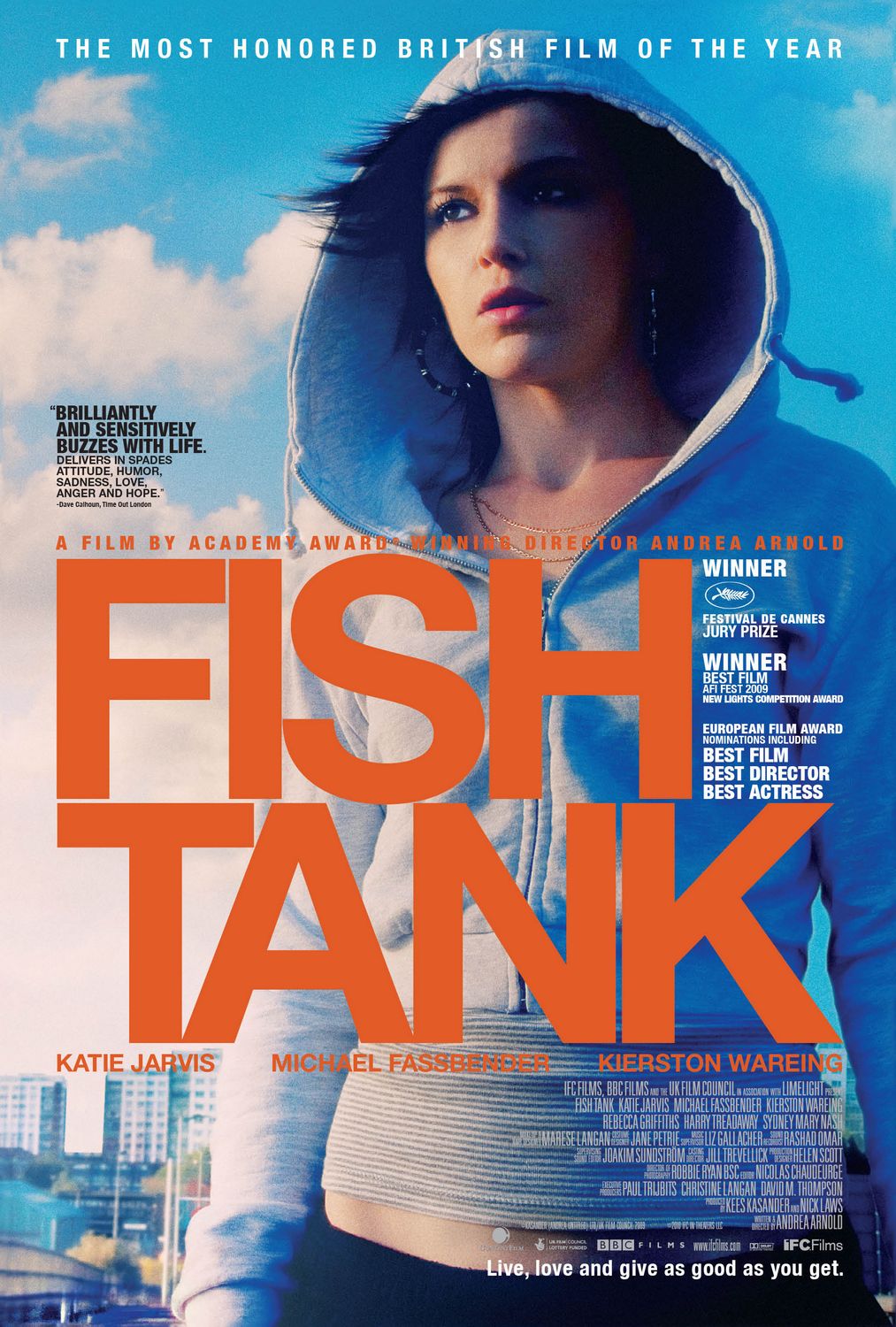
  • Context - sometimes little is given about the film due to limited imagery (e.g. Fish Tank), leaves the audience guessing/creates enigma. Other times a lot can be hinted at (e.g. The King's Speech) due to what's in the foreground and background

Extra Large Movie Poster Image for Fish Tank
The lighting from the left side creates a deep shadow on the right side of the character's face, suggesting drama. Her facial expression shows that she is looking at something or has seen something, and this adds to the drama and tension being conveyed in the image.
Stereotypically, her clothing implies that she's around the South London area, which is known for being quite suburban and working class, so the income is low therefore her clothes won't be at the top of the market. She is wearing a cheap-looking hoody that is slightly open at the neck, suggesting that she is confident in herself and wants to be noticed. This can be seen behind her in the background, with high rise flats and terraced buildings, typical housing for that area of London.


The lighting behind the actors is quite low key, but in front of them around the statue is high key, suggesting that there is a bright future. Their clothing of the actor on the left shows he is of royalty (clearly the king) and the actor on the right is not of royalty, but of a high class. Linking to the 'bright future', the facial expression of the actor on the right shows he is confident and optimistic, whereas the expression of the actor on the left shows he is nervous, suggesting something about their characters. The title has a 'shiny' look to it, almost as if it's made out of gold, which suggests wealth, and the crown on top of the 'i' continues the theme of royalty.


We included the same conventions in our film poster:


  • Text - largest font is the title, Blind Faith, followed by the names of the two actors, then the reviews, ratings, billing block and awards
  • Imagery and context - a photo of the two characters on a road (black and white, photo-booth picture), hints at a few key aspects of the film, doesn't give a lot away; suggests their closeness as friends, road could imply something else/something darker

Review
i) Little White Lies (LWL) is a magazine that contains reviews and information of both mainstream and independent films, and also more media products such as video games. It's layout is very sophisticated and the language is both colloquial and formal; this is to make it easier to read for it's audience, who are mainly upper class males ranging from those interested in films to those working in the industry. Because our audience is different, teenagers/young adults aged 15-24, we had to write in the same style but in a way that our audience would understand, whilst keeping as close to the house style of LWL as possible as depicted below.

https://www.youtube.com/watch?v=Fe9AAfGgJuU


ii) We kept as faithful to the house style of LWL as possible, which included:
  • Using the same font - two different fonts for the title and the main body of text
  • Using the same measurements - the spacing between the paragraphs, the screenshot from our film, the font size
  • Writing in the same language style - both formal, complex diction and a slightly more colloquial tone in some parts
  • Writing in the same paragraph structure -

Correct dimensions needed for the review
Screen grab from film used at the top of our review
Title and director information below screenshot
Final edit of the review

2. How effective is the combination of your main product and your ancillary tasks?


3. What have you learned from your audience feedback?

Towards the beginning of the portfolio, we struggled to come up with a name for our film. We'd decided on two possible names, Blind Faith and Out of Sight, but couldn't choose which. We then decided to use the website SurveyMonkey and got our audience to choose which name they preferred.


We wanted to get our audience to feedback because we wanted it to relate to their age group as much as possible, so we based our decisions on what our audience wanted.

We also got feedback on the layout of our title, as we wanted to link it as much as we could to the theme of our film, so we incorporated braille into the formation of the letters (using Photoshop).


Also, we recently got feedback on our final poster design using the social networking site Facebook.


4. How did you use new media technologies in the construction, and research, planning and evaluation stages?


http://prezi.com/9n-d9aamngzl/?utm_campaign=share&utm_medium=copy&rc=ex0share

Tuesday, 25 November 2014

Poster Research - The King's Speech

The names of the actors appear above and below the title, the three main actors having slightly larger fonts than the rest of them that are listed. Only two actors appear on the image and look as though they are in character, and their names appear on the same sides of the title as they do. The images of the actors look as though they've been placed over the main background. The text is centered and placed towards the bottom of the poster, and it's superimposed over the image, whereas the billing block is placed at the very bottom of the poster. It's still centered and there isn't a lot of it so it doesn't draw attention away from the image or the title. At the top, above the ratings and quotes from The Daily Mail and Company, it says 'The nation awaits...', implying both the content of the film and the actual country waiting for the film to be released.

Media Language
The lighting behind the actors is quite low key, but in front of them around the statue is high key, suggesting that there is a bright future. Their clothing of the actor on the left shows he is of royalty (clearly the king) and the actor on the right is not of royalty, but of a high class. Linking to the 'bright future', the facial expression of the actor on the right shows he is confident and optimistic, whereas the expression of the actor on the left shows he is nervous, suggesting something about their characters. The title has a 'shiny' look to it, almost as if it's made out of gold, which suggests wealth, and the crown on top of the 'i' continues the theme of royalty.

Representation
This is clearly a positive representation of royalty and high class; the actors clothes are pristine and their surroundings look very grand, much like a palace. Also, the fact that the two actors are male represents the era in which this film is set, which was during the 30s and before the 1975 Sex Discrimination Act.

Audience
The audience for this film will mainly be adults, as the younger generation would not understand or know much about the history behind the characters or the actual story. They would be around the 30 - 45 age group and would be from standard class and above, as cinema tickets aren't usually cheap. People that would watch this would be interested in the history of the country and it's rulers.

Narrative
Unlike the other posters, this one shows more about the content of the film. The background shows a huge crowd of people gathered around the statue of Queen Victoria (the setting then obviously being London). The actual shot is from inside Buckingham Palace as the king is waiting to go outside to give the speech, hence why the crowd is there and why the tagline is 'The nation awaits...'. Applying Levi-Strauss's theory shows that there are some simple binary oppositions. The two main characters are positioned so they are almost 'above' the crowd outside the doors, which links to their status in the film. This is a clear demonstration of wealth and working class, as were a lot of people in those times.

Genre
Judging by the lighting, the facial expressions of the actors and the justification of the text and how ordered it is, the audience can deduce that it'll be some sort of drama. Also, mainly because of the title and who the characters are, it is also a historic film that educates people about a certain topic, and also biographic as it's about someone's life.

Monday, 24 November 2014

Poster Research - Selfie

Selfie Short Film PosterOn this poster, the names nor images of actors are not shown, not even in the billing block, which is very standard and the text doesn't quite match. The text and imagery overall is very minimal, and doesn't give much out to the audience. The title of the film is the largest text on the image and is placed at the top above the image, but the lighting is so dark that it's unclear if the title is either on top of or separate from the image. The image itself is quite self-explanatory, even though there are no images of the characters/actors; the phone links to the title and the blood suggests violence and/or gore. There is no certification, but judging by the fact that the imagery contains blood and has a general sinister look about it, it would more likely be around a 15.

Media Language
The main image shows a phone in very low key lighting, immediately suggesting a sinister atmosphere. The blood dripping from the camera then implies that there will be some kind of injury or death, adding to the dark and sinister genre, then the hand holding is green in colour with black nails, which suggests some supernatural undertone.
The word 'selfie' is a very youthful word, so it therefore shows that this film in involve teenagers. The actual lettering of the word is very harrowing and sketchy, bringing out the horror element.

Representation
The combination of the horror genre and the almost comical word 'selfie' is like a juxtaposition, in a way. It's almost suggesting that this seemingly harmless action is potentially lethal, which actually then counteracts the horror element of the poster and film as a whole.

Audience
Usually, the audience for these kinds of films are people who like horror films and that genre in general. This poster looks quite low budget; the title font is repetitive, the billing block font doesn't look right and there is no other information around the image. The audience for this would possibly be around the 16 - 24 age group, as it's usually teenagers and young adults that enjoy horror films, and also the fact that teenagers can react and relate to this situation of taking a 'selfie', linking back to the youthful aspect.

Narrative
The narrative and chronology for this short film is, again, unclear, however the audience can pick out what may or may not happen from this poster; the camera dripping blood could signify that taking a picture could be lethal.

Genre
The genre of this film is extremely clear; the font, the lighting, the image, the colour all suggest horror. The way that all of these factors are presented shows that this short film is of the horror genre. Altman's theory could easily be applied here, despite the fact that there are so little semantic codes. The blood signifies death, the discoloured hand suggests unnatural happenings and the low light implies fear, which are all common codes featured in the horror genre.

Monday, 17 November 2014

Poster Research - Fish Tank

Extra Large Movie Poster Image for Fish TankThe names of the actors appear beneath the title in the same font and colour, however the images of the actors don't appear, because it's only one image as a whole (possibly the main character). The text is placed over the top of the image and as the main image is slightly to the right, the title is over some of the background. The title itself is the biggest text on the poster, whilst the other information is in much smaller text. At the bottom of the billing block there is a website and it's for IFC Films. There is only one quote and it's from the magazine Time Out. The billing block is juxtaposed to the right, mainly because the text is white and stands out against the darker part of the image.

Media Language
The lighting from the left side creates a deep shadow on the right side of the character's face, suggesting drama. Her facial expression shows that she is looking at something or has seen something, and this adds to the drama and tension being conveyed in the image.
Stereotypically, her clothing implies that she's around the South London area, which is known for being quite suburban and working class, so the income is low therefore her clothes won't be at the top of the market. She is wearing a cheap-looking hoody that is slightly open at the neck, suggesting that she is confident in herself and wants to be noticed. This can be seen behind her in the background, with high rise flats and terraced buildings, typical housing for that area of London.

Representation
Similarly in media language, the character is shown in suburban London. That area is known for being quite rough and shady. This could therefore represent the female character as being quite rowdy and forward, which is demonstrated in her stance and clothing.

Audience
The audience for this film is ambiguous, but could be of a similar class as the character depicted on the poster. The age would be around 20+ judging by the look of the character, but without knowledge of the actual content of the film, a specific age cannot be identified. However, tickets to see the film would be relatively expensive, so people of a class with moderate income would also be able to see it.

Narrative
The lighting and her facial expression suggests that something dramatic is going to happen, or has already happened, so the narrative of the film could be something to do with this girl's life and what happens in it. The chronology of the film is unclear, but the audience can assume it's linear. Using Todorov's theory, is it clear from her stance and her expression that the story is in stage 2 of the model, also known as the disruption; her face shows concern, which could be significant.

Genre
Again, the genre of the film is unclear, but it can be deciphered from the image and tagline; "live, love and give as good as you get", as it suggests possible romance and drama. If Buckingham's theory were to be applied, it was obvious that this was breaking the stereotype; most posters would have a strong male character displayed behind the title. This however shows a strong female lead, which therefore shows that attitudes towards women have changed over time, meaning that this film will have a large feminine atmosphere.

Tuesday, 7 October 2014

Applying Audience to our Final Idea

As we are using teenagers/young adults to act in our short film and the setting is based around the college, our audience is inevitably going to be around the same age (16-20). They will be able to relate to the characters to some extent, knowing what they're experiencing at college and what they experience outside of college; the emotions etc.

Our film focuses on some of the downsides of college life, as some teenagers can experience bullying in one form or another, in this instance because of disability. Unfortunately, some of our audience could be able to relate to this because they may have experienced something similar. However, on the more positive side, they can also relate to the romantic aspect of the film, as most teenagers experience some sort of relationship during their college years.

Most teenagers won't be able to relate to the ending of our film, as it's very unlikely they would have experienced similar traumatic events. Though on the contrary, the actual shock of the ending makes the audience think how easily something like that could happen.

Script

[starts with a few shots of Ethan watching Faith, seeing her by herself. He sees her being bullied and wonders why]

[Ethan sees bullies knock a stack of books from her hands. They run away laughing and he helps Faith pick up books]
Ethan - Uh, here you go [holds out books, Faith doesn't take them, as if she ignores them]
Faith - Sorry?
Ethan - Uh, your books
Faith - Oh, right. Thank you
Ethan - Are you, uh, okay?
Faith - Oh, yeah, I'm fine
Ethan - Oh [pause] oh god, are you- blind?
Faith - Yeah, yeah I am
Ethan - Oh god, sorry, I didn't realise
Faith - It's fine, not everyone does
Ethan - Okay, well, you're okay getting around?
Faith - Yeah, I'm fine. Thank you, again
[she walks away]
Ethan - Oh, uh, don't forget your books
Faith - Oh! Sorry, thank you
[Faith takes the books]
Faith - I don't think I caught your name
Ethan - Oh, I'm Ethan
Faith - I'm Faith. Hi
Ethan - Hi
[she walks away]

[a few shots show Ethan talking to Faith more, them sitting and laughing together. They go to several places and they grow closer]

[Ethan sitting with his friends and is getting texts from Faith]
Friend - Is that your girlfriend, again?
Ethan - She's not my girlfriend
Friend - You text her a lot
Ethan - We're just friends, okay?
Friend - Why do you still hang out with her?
Ethan - She's nice
Friend - She's blind
Ethan - And?
Friend - It's like she's [pause] broken
Ethan - Shut up!
Friend - Well, I know she's broken
Ethan - Could you be any more insulting?! You know what, screw you [leaves]
Friend - [calls after him] She's not worth it!

[walking through woods]
Ethan - So how long have you been blind?
Faith - Excuse me, 10% vision over here!
Ethan - Alright, alright! [laughs] How long have you had [imitates Faith's voice] 10% vision?
Faith - [laughs] About two years
Ethan - Really?
Faith - My eyesight was already pretty bad before, and it wasn't getting any better
Ethan - Did you have, like, a condition?
Faith - Just poor eyesight. Okay, I had a choice; either go on with my life and let my vision gradually get worse until I can't see a thing, or have an op that'll save me at least some vision [pause] It was scary at the time
Ethan - I'm not surprised
[silence, diegetic sound of trees]
Ethan - Does it make you sad?
Faith - What?
Ethan - That you can't, well, see?
Faith - Oh, well, not really. I mean, I miss it every now and then, but sometimes the world seems better [pause] when you can't see it
[Ethan thinks for a few moments and then smiles]

[a few more shots of Faith and Ethan together, this time in Brighton. They go to the pier and go on the arcades. They then go to Starbucks and afterwards, a retro photobooth. He tries to hold her hand, but doesn't quite do it. They're then shown walking across a road and Faith accidently drops the photo. Ethan sees and stops to pick it up, not noticing a bus heading down the road towards him. He looks up but it's too late for him to react. The screen goes black]

Monday, 6 October 2014

Applying Genre to our Final Idea

Due to our main characters being the binary oppositions of male and female, the audience can assume that this the genre is romance, because they can instantly see the boy and girl being together. They can also assume that this would be a teen drama, because most teen drama films are usually set in schools regardless of nationality.

Using Buckingham's theory, we can show that our film is different from any other teen romance/drama. Our film includes the aspect of disability, which is our primary focus. Most teen films, with the exception of the recent film The Fault In Our Stars, don't highlight disabilities. Our film is different because it draws attention to that subject, and therefore isn't falling into the mainstream category of teen dramas.

Neale's theory shows some characteristics of Faith's character to be strong and independent; how she can get around without using her stick and be so calm about being bullied. She is also confident in her appearance, as she is seen wearing odd shoes (as we decided was a good idea for her costume) and not caring about what other people think. Even though she has Ethan to guide her, some things about her are stronger.

Thursday, 25 September 2014

'Just Say Hi' - MRANG (5th Post)

'Just Say Hi' by John McPhail

(Link to the film)

Media Language


  • Music - cheerful, sets atmosphere
  • LS - establishes setting, characters
  • CUs - focuses on main characters
  • Parallel editing - shows connection between characters
  • Facial expressions - he's trying to talk to her, she doesn't want to

  • Transition - change in time
  • Change in costume - also shows shift of time, creates ellipsis
  • MS - focuses on his expression, notices her more, she smiles because she's being noticed
  • Walking backwards - nervous to talk/look at her, she's confused at this
  • CU - sees her face, awkward moment, he helps her out
  • Smug expression - knows his way with women
  • Grin - excited because he helped her

  • Box of tissues - he helped her, he cares
  • Smiling - she knows he cares
  • Different shot/MS - makes audience see something different
  • Changes hairstyle - wants to look appealing
  • He falls over - clumsy, funny, stereotypical 'romance', instantly embarrassed
  • Music - lyrics suggest feelings towards each other

  • Two shot - nearly together
  • He slides towards her - building up to climax
  • Cut - hides new character, blocks them, frustrating for characters and audience

  • Facial expression - looks determined
  • Match on action - reveals it's not her, awkward
  • Doubt - she may not come
  • Parallel editing - shows connection, OTS finally shows how close they are
  • Two shot - finally together
  • Lull in music - can hear dialogue, dramatic


Narrative

Bordwell and Thompson's theory can be applied effectively to this short film. The audience doesn't know the back story of these two characters, so the plot is only focusing on how they met.

The transitions and their continuous change of clothes shows the days passing, but it is unclear if it is consecutive. However, the plot does leave an ellipsis as to what they do when they're not at the bus stop; do they think of each other?

At the end, when they finally meet, the audience can only assume that they continue on into a conversation that hopefully leads to some form of relationship, even when it's only hinted by the story.

'Sweet Nothings' - MRANG (4th Post)

'Sweet Nothings' by Giles Ripley

(Link to the film)

Media Language

The film begins with an LS of a man coming through his front door. He's wearing a suit, so the spectators can deduce he has a well paid job. He comes in and checks for messages on the phone. Here it cuts to a MCU of the phone, suggesting that it is of some importance. The phone voice over announces no new messages. It then cuts to his face, his expression showing mild disappointment, as if he was anticipating something.


He picks up the post-its and takes one off. It cuts to an OTS of what it says. The handwriting is obviously female, and the gender of the voice over confirms this. It cuts to his face again and his facial expression shows he's happy and content. It fades to black, suggesting time passing and creating an ellipsis.


Am LS shows him returning home again and the same routine is showed; he comes in, shuts the door, puts his keys down and checks the phone. The spectators can then deduce that he is obviously waiting for a specific call. He picks up the post-its again and the female voice over reads it out; his facial expression happier.


The routine is showed for a third time, only this time he is holding a bunch of flowers. The lighting is very high key, which mirrors his mood and the atmosphere. He does the same thing only to stop at the post-its. He drops the flowers and the voice over speaks, an ECU confirming what she says.


He then picks up the phone and tries ringing someone several times. The handheld camera movement adds an unsteady atmosphere. There are a few edits to imply his distressed state, and his voice when he speaks is very shaky. It cuts to him sitting on the floor in despair and then to an ECU of his heartbroken face, his dialogue showing he is desperate for something.


If fades to black and the off-screen sound of a doorbell can be heard.The next shot is an LS of the man running to the door and opening it. He is in a dishevelled state and his facial expression shows worry and desperation. He quickly takes the box from the postman and shuts the door in his face, cutting off his dialogue. This shows that whatever he now has he must have it now.


He hurries to open the box, a few edits and CUs showing his shaking hands. His breathing is fast and uneven, and the handheld movement of the camera adds a lot of instability to the current situation, as if mirroring his turmoil and insanity.


He finally opens the box and takes out the package. An OTS CU reveals what it is, and the audience are in for a shock. He opens the kit and takes out the new pack of post-its. At this point, the audience is slowly realising what is going on and how this man lives his life.


The female voice over returns, but as she speaks, her voice is warped and a second voice can be heard speaking with her. This new voice is clearly male that's imitating a woman's. As the man reads the notes, his happiness slowly descends into deep satisfaction and insanity shown through his facial expression.


He sits on the floor again and as the male voice over echoes the same words, the camera pans and tilts up to the right to reveal his fireplace covered in post-its. It stops on a picture frame and jump-cuts closer. On each jump-cut, there is a loud noise that enhances the shock effect of what is being shown, the music slowly building up to a crescendo. On the last one, it cuts to black, leaving the audience in complete shock


Genre

At first, it is unclear that this is a comedy. Using Steve Neale's theory of repetition and variation, this short film's genre can be identified.
  • Beginning shows casual 'relationship' - nothing different about it
  • Shows relationship is steady
  • Apparent relationship doesn't end well - man breaks down
  • Calls friend(?) - still not clear it's a comedy
  • Package arrives - audience question what's going on
  • Opens package - reveals plot twist
  • Comedy element recognised - man acts as his girlfriend
  • Slightly creepy - mental disorder?
It's only at the end it's seen as a comedy, because this man wants a girlfriend so badly he acts out one for himself.

However, amongst this, there is a darker side to it, as the man may have done this for so long that it has become part of his life. He stated that he 'can't live without her', even though there is no one to live without. He can't continue without making up a fake girlfriend, which in itself is quite sad.


Representation

What's represented in this short film is a number of things. One is gender and how it's communicated. The man is a stereotypical businessman; suit, briefcase, works every day etc. The female aspect of the film is similar, even though it isn't real; loving, stay-at-home type etc. 

Towards the end, when it is revealed that his relationship is fake, the man is seen dressed up as his 'girlfriend', which then introduces the representation of sexualityEven though this man longs for a relationship with a woman, he has to make it up himself. This could suggest something about his sexuality and why he chooses to do it.