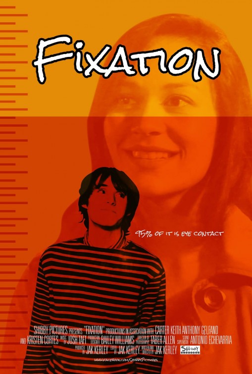
This film poster is for a short film called Fixation. 2 characters are shown on the poster, maybe suggesting they are the two main characters featured in this short film. We can get the idea that the guy is 'fixated' on the above girl by the way he is looking upwards as if at her picture. The image of the girl is more faded with the guy character being the more prominent feature in the poster as he has been overlaid on top- he is the only thing to feature black. The rest of the poster has been given an orange tint with a lighter colour orange used in the top quarter of the poster.
The main text used is the title 'fixation' which doesn't follow the usual conventions of a film poster as it is placed towards the top of the poster rather then more noticeably in the poster- the characters are the main point in the poster. As well as this, the title is in more of a curved, handwritten style rather than bold and block style print. The title is placed in the middle with the same size gap between letters and the distance between each side of the page.
 Another convention of a short film poster which is displayed on this poster is a website- this is a Facebook page advertised at the bottom 'Shiby Pictures' which is able to build a fan base of the company building them into a more independent film company.
 At the bottom, capital, more bold letters are used to display the actors, director and film production company, however it isn't as big to read as the title which stands out much more. As well as this music, sound and director or photography is listed at the bottom. The names are listed in bigger letters than the subtitles so this makes them more noticeable. The text has been centred however is hasn't been justified to either side.
There is a tagline displayed on the poster '95% of it is eye contact' which is displayed to the side of the boy character in the poster. This may be directly related to the title 'fixation' leading to the conclusion of the genre to be a sort of romance, teen movie. The teen idea would also link in as the subjected audience this was aimed at due to teenagers being able to relate to the characters. Therefore I would therefore rate this film a 12A.
This could be used as an idea on our short film poster 'Blind Faith' as we could use the caption 'sometimes the world seems better when you can't see it' which is a phrase used by Faith and can sum up our film.

Try to get the image re-uploaded - it's not showing on my mac. The analysis is ok, but you should try to make this post more visually interesting - eg highlight the conventions using colour, and summarise overall the techniques used that are typical of any film, compared to short film conventions.
ReplyDelete